About the Project
Joseph F. Spalding was a commercial photographer in BC from 1904 to 1958, documenting activities in the town of Fernie and most of southern BC and the mountain parks of the Rockies.
The content of the website will feature a selection of Spalding’s photographs and information about the themes in his work (the six navigation sections) and their relation to the province’s social climate. This content was organized and is being prepared by a researcher.
About the Design
After developing a sitemap with the project researcher I spent approx. 15-20 hours on this design template. If you have the time please look it over (opens in new window), read my notes on it below, and consider its design.
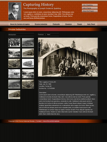
- This is an image of the template and not a working web page. Temporary text and images have been used prior to the final content being provided. Content in this template is only included to give a better sense of the final product. For example some sections will have upwards of 15 thumbnails. The final product will of course include active navigation and resizeable / selectable text.
- The colour scheme reflects an obligation to the current Fernie Museum website, as well the previous web developer’s original design for the exhibit website.
- There is a subtle patterned texture to the head and navigation elements, lending a sense of refinery, depth and reflecting the style of the Spalding era.
- The head and navigation will also span the width of the browser window, emphasizing the horizontal, drawing the eye across the primary info (the title and short description of the project) and creating an anchor and contrast for the vertically-oriented content below.
- The navigation will change colour on mouse-over to provide positive confirmation for users that they are in fact links. Clicking a navigation link will load that section’s title, introduction text and thumbnails in the main content area.
- The black-striped background for the main content further helps break up the horizontal of the head and nav as well as the landscape orientation of many of the photographs and thumbnails. A dark background provides better contrast and punch for black and white photographs and is OK for the small amounts of textual info the site will have.
- Clicking a thumbnail will load an enlarged version of that image to the right, along with that image’s relevant information.
- The template width will accommodate various browser window widths down to Mac IE users at 800×600
- All primary information is oriented in the top 300 pixels of the page. Users immediately know what site they at, what the site contains, and how the they will interact with it. This also allows users to quickly absorb and orient themselves without having to scroll down every page. For example, users can quickly access all sections of the site via the main nav, or browse through a specific section’s images by clicking Next in the main content area without having to scroll to see the large image.
Leave a Reply