
My brand-new iTunes software (click to view full-size (1055×762))
Cool things
The rating labels may prove to be a nice meta-data feature, and I can easily click within in the playlist to rate songs on the fly. How about a larger range than five stars (say, out of 10 instead). And no stars doesn’t equate terrible because all my music is currently at no stars so it is more like neutral or no opinion. How about a negative rating for songs that make you puke.
Click on the artist or time in the time window to view more information about the track.
Changing a field description for id3 tags across multiple files is nice.
In alphabetizing listings, it ignores definite articles. Nice. Like “The Cure” is in the Cs, not the Ts, like it was in Winamp.
Creating new playlists is one-click away and doesn’t require me to go File – Save As – Select Folder, etc.
I like the album cover image that auto-displays. I know Windows Media Player does this, too. I wish, however, that with iTunes it would be associated with the tracks in the library listing or something. Browsing quickly with a visual like an album cover would be great.
Good: the drag and dropping of files from Windows Explorer in order to load them.
I like how I can flip to a playlist, then flip back to the main Library and it will remember the last artist I was looking at.
Mild to fairly annoying
What’s the current track!?
While working in four other programs, I regularly take a quick glance at my player to see what song is on. Hard to do when I have to squint and scan for the little iTunes speaker icon in the playlist of 1000s of songs. When I click a track, it’s highlighted in dark blue across its entire playlist row (this is what I want to happen automatically), but remains highlighted regardless what is currently playing (which confuses me). Winamp bugged me in this regard, too.
The song or artist name is not shown in the start bar. Come on, every other program does this. I want to glance from my other programs and know the song without having to alt-tab or hover over the tiny task tray icon.
![]()
Oh, you are iTunes and that is more important than telling me the song you are playing.
Turns out the little return arrow in the light-green track info window at the top highlight’s the current track in the playlist. But no tool tip over this, again, tiny button to indicate this. I admit, I should get used to looking at the time display area, but�
Aesthetics
Aesthetically, the small black aliased text on the green background of the time display at the top of iTunes is old, unstylish and comparatively under-designed. Ugliest track slider ever. While I’m at it, isn’t the brushed steel look overdone? I want an Aqua theme (do Apple iTune users get this?).

So 1990s.
Size Matters (Fitt’s Law)
Fitt’s Law basically says: “the time needed to acquire a target is a function of the distance to the target and the size of the target.” Applied to usability design, it means it’s often better to move target buttons closer and make them larger for commonly used functions.
Functionally, the track scan slider is too small and thus finicky to use. And how do I scan a track with the keyboard (something I did often with Winamp)?
The taskbar icon, on mouse-hover, shows track info, but again, it is a tiny target and takes a couple seconds.
Throughout, icons and text are not large enough (even after enlarging the text under Preferences). And there aren’t enough icons representing information, something I’ve come to appreciate with favicons in my Firefox bookmark listings. With seven to eight windows in iTunes it seems like too much closely-related and close-looking information for me to digest. For example, maybe a background colour difference or icon listings or size to distinguish Genre and Artist windows. Of course, this stuff was much worse in Winamp.
The default little arrows next to every field of a track listing (which links to the music store) is overkill and mildly annoying. Thankfully you can turn this feature off.
Size Matters 2: Memory
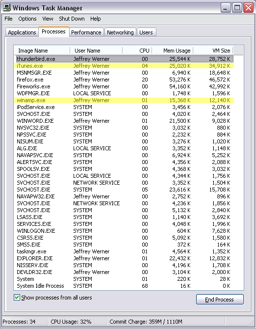
Right after install, Task Manager said iTunes was taking up 50MB, while Winamp was around 10-15MB. Although, my friend on a similar PC system said his iTunes took up only 13MB. Update: as of 6:26pm Dec. 7, iTunes is at about 25MB.
Big slowdown when:
- dragging to change window or column widths (particularly the left Source column)
- minimizing the window
- launching program
- using the visualization feature (which, btw, like Winamp and Media Player, hasn’t changed in five years and is nothing to write home about)
- alt-tabbing between programs and back to iTunes
- skipping songs with the keyboard.
I’m running a NVIDIA GeForce card with 64 RAM. Not the best, but hey, it’s just playing mp3s.
It runs and/or installed four programs: iTunes, iTunesHelper, iPodService and qttask. I only need one of these. I had to go into msconfig and get rid of the start-ups for qttask and iTunesHelper. I don’t own an iPod so is iPodService running non-stop in case I buy one and it refuses to be caught off guard? Turn on when I need you.
When I type a name really fast in the search field it slows down too much.
Playlists
I had a folder of new songs. I just wanted to load that folder of new songs and play only them. Couldn’t do it unless I created a temporary play list and dragged and dropped the files in.
Play the intended track order. Even if you download a full album (say, from iTunes Music Store), in order to play them in numbered order you have to display the track numbers (right click on playlist column headings, select Track Number), then organize by track number, which doesn’t work with multiple albums in the playlist (it disregards artist or album and just lists all Track 2s together, all Track 3s together, etc.) But I think, by fluke, you can click Track order then click Artist order and it organizes by album then track order. But I mean, come on, this should be easy.

Uhm, ya, it’s ok, nevermind sorting them by track.
I want to be able to drag and select a bunch of songs in a listing with my one mouse hand, but am forced to shift-click with two hands.
It appears the Song Name column has to remain at the far left of the listing. You can’t say, put the track number or artist first. On the left, like where Western people are taught to read from first.
Quirks
OK, I thought ctrl-left or ctrl-right skipped tracks (I can get used to that and it’s more intuitive than the zxcvb of Winamp), but apparently just left or right does, too, which is good, by why not just leave it at that?
Changing a field description for id3 tags across multiple files is great, but you:
- Have to make sure to check the box next to field for some reason, and
- Make sure all the files aren’t read-only. If just one out of 100 is, none will update, but iTunes doesn’t tell you why.
The Party Shuffle seems over emphasized and redundant. Why have Shuffle and Party Shuffle, when all party shuffle does is show what’s coming up next? Why not have just Party Shuffle, but just call it Shuffle. I was mislead into thinking it would auto-select songs suitable for a party! If done well, that would be cool. The blurb that appeared the first time I selected Party Shuffle made me think it would scan my library for songs that were high on some internet database chart, say the iTunes store itself.
When I created a new playlist, the Eye icon (for browsing by artist or genre in the main Library Source) is replaced by a Burn Disk icon. Now I am confused and want the Eye icon back.
Not quite sure what the tiny check marks are for next to every song in the playlist window. I assume they are to stop the song from playing, but still keep it in the list? When would I use this?
I just tried to change all my Aesop ROCK listings to Aesop Rock, but it was hard to do because it kept auto-completing the field with the previous name from its memory, i.e. the all-caps version. I had to get creative and remove the space in the name, then delete from the back of the word, re-type and re-add the space.
Why do I have 20 tracks by Beck, but the one that’s labeled beck is the one iTunes displays in the Artist listing until I change that one file. Maybe it was because that one file was the most recent addition to my harddrive.
A general complaint about meta-data, but why not have multiple Artist Name fields. I have about 60 Brian Eno mp3s. Many of them he collaborates with other artists, but I hate having ten listings for Eno in my playlist (Brian Eno & David Sylvan, Brian Eno and Fripp, etc.). And in the case of Eno and Fripp, they both have equal weight to me, so I don’t want to label a track as Eno, because it wouldn’t show up under Fripp’s listing.
Comments
7 Responses to “First Impressions of iTunes”
– If a song makes you puke, why not delete it?
– Most consider ignoring articles as benefit and that other programs handle them incorrectly.
– I don’t experience any slowdown at all when doing any of the things you listed. It’s probably angry with you for using RDRAM.
– The tiny check marks help when syncing music with an Ipod. I don’t use them but if your music library is larger than your Ipod capacity I think they would be necessary.
– Ya, I guess I never get around to deleting crappy songs. I would have to locate the song on my harddrive. But with iTunes, I like the song find feature, which auto-opens Windows Explorer and even highlights the offending file.
– Sorry, I need to make that first heading clearer: ya, I like how it ignores articles like The.
– Maybe it’s my graphics card.
– iPod…interesting. Maybe it could leave them off until I get an iPod.
Jeff. I like the new way to make comments. Unfortunately what your review on iTUNES misses is its best feature. Music sharing. On the Harvard Local network I can listen to anyone in my dorms music (if they have itunes open). With a little extra feature called ourtunes, or mytunes, I can get that music.
Your task manager seems to have some adware in there…..
First, great site here. Love the design.
Second, I don’t have time for the few things I disagree with you on.
Third, in general,, this is a great review. Nice work. :)
Finally, Mac users also get the brushed metal look. iTunes is virtually identical on Mac and Windows. It is a bit played out, and Tiger (the next version of OS X, coming over in the summer, I believe), updates it a bit (but probably not enough).
Hi,
I really like iTunes. It’s my favourite in front of both Winamp & Windows Media which are the two current other MP3-jukebox progs I’ve got installed.
But I wonder… I’ve stored all my Mp3-files at drive I:\
My music folder used to be stored in My Documents, but I relocated it to I:\ as well
How do I delete my files completely when pressing delete? It used to be a dialog box for this before, but now this box is gone.
Anyone know how to figure this one out?
Sometimes when on another site, such as my pharmacy site and I type in a search on their site and click on the search icon next to it, itunes opens and I lose all the information on the page I was just on!!??? why does this happens and how can I fix it?
would be nice if they would add a skin feature like winamp does… ANd I wish they would let me define the columns in the browes feater!! I don’t brows by genre… I don’t know anyone who does.