Eindhoven’s Van Abbemuseum is free to the public on Thursday evenings, and although I’ve been to the nearby Designhuis, I’ve been reluctant to check out its big brother. I’m generally pretty bored by galleries and museums (although I do enjoy working with them).
But surprise, the Van Abbe is pretty sweet, surprisingly contemporary and physically large (I got lost twice). Some of the exhibits struck out a bit for me, but no loss considering there was a lot to make up for it. There are, unbeknownst to me before going, four concurrent exhibits.
Be(com)ing Dutch is the main attraction this month, which is primarily a collection of black curtain-partitioned rooms featuring documentary and new media videos that “focused on what have become sensitive issues for the Netherlands, such as identity, nationality, citizenship and social cohesion.”
El Lissitzky and contemporaries is an overview of the early 20th C. Russian artist/designer using pieces from the museum’s permanent collection, apparently the second best, so they say, after Moscow’s. There is also a lot of his buddy’s, the Dutchman Theo van Doesburg, work and even a few Moholy-Nagies and Mondrians, which, if you’ve ever had a conversation or class with Emily Carr instructor Vjeko Sager, you’ll have heard of these influential, monumental guys.
Living Archive – Mixed Messages features “eight works from the Van Abbemuseum collection…presented in seven small rooms.”
Plug In is kind of interesting in that it brings in guest curators and asks them to re-imagine the museum’s collection in an ongoing series. “Each museum space has its own independent, themed display as well as its own time span.”
And now some photos, which were kindly permitted. Where I remembered to record it, I’ve included some provenance for the works I half-randomly, half-intentionally, documented for what I liked and figured you guys would like.


The poster child of the exhibit and the only work I knew I wanted to see is this arrangement of foreign passports by Tintin Wulia, who collected 129 of them displayed in a colour gradient on thin plinths, with five speakers emitting recorded conversations at intimate volume levels embedded in a wall.
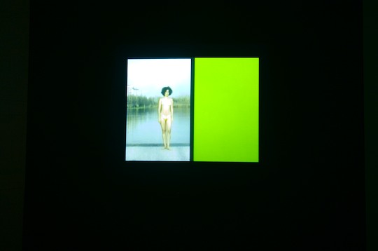
This video piece (one of the many in small little rooms) asked former artists to describe why they quit, and showed clips of their video work next to transcripts of their answers. One of the few videos I sat all the way through because I enjoyed its succinctity in both text and use of referenced video clips. And I appreciated the candor and acceptance of the subjects who were happy in their regular jobs, and their insight into why they quit being artists. I didn’t even know you could quit (these people didn’t necessarily fail at the practice: some were internationally known).
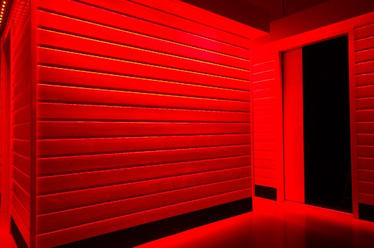
More small rooms with videos about immigrants. I think, because I didn’t watch–though I liked the Lynchian lighting outside of them.

I liked this painting. Looks like black velvet (but not) and the style of an artist’s work I encountered in a collection in Indonesia last year.


Not sure what the sort of half-ass (visitor contributed?) protest signs were about. They said things like “Eindhoven Need I Say More?” but I liked the writing on the (unrelated, different room) painting.
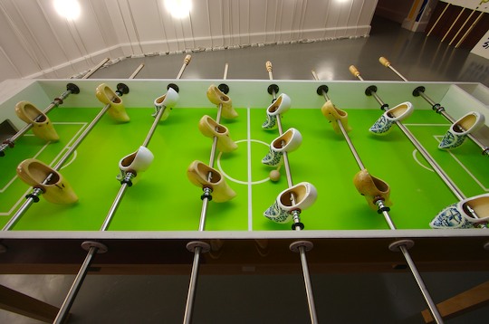
Hehe, working foosball table with Dutch wooden clogs.

In the same space as the foosball. Interspersed were illustrations from pop culture and even a still from an Aphex Twin video.

I also liked this painting, Volkslogement, 1928, by Dutchman Charley Toorop, probably because it reminded me of the Canadian painters Maxwell Bates, and Phyllis Serota.
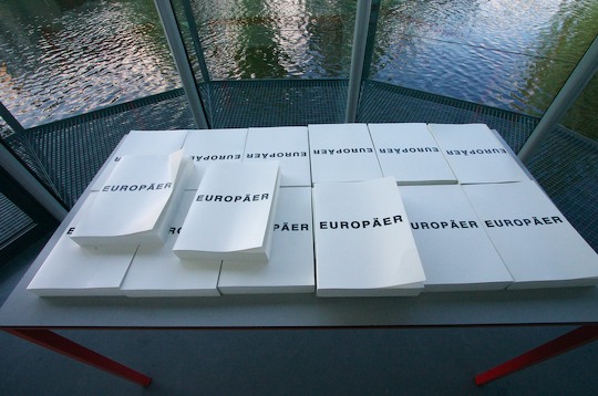
This collection of white books (in Dutch) was related to another exhibit, but I really like how the Van Abbe has these little glassed alcloves dotting the gallery spaces, overlooking the central pond.
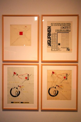

Four designs (left) by Lissitzky: Werktekening voor Nieuwe, 1923; Figurinen. Die plastische Gestaltung der elektro-mechanicshen Schau Sieg über die Soone, 1923; Proefdruk voor deel van de Schaumaschinerie als titelblad, 1923; Ontwerp voor een deel van de Schaumaschinerie als titelblad, 1923. On the right is a near life-size print of football players, sliced up.

The Constructor, 1928. A treat to see this original print in person. And tiny, too (maybe 10cm square). Pardon the lighting highlight in this photo.
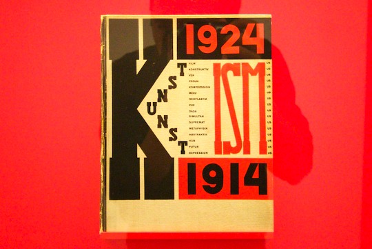
Loved this. And how a bunch of these works were displayed beneath a large, tilted glass panel and above red.

More Lissitzky, The four arithmetical functions, 1928 (reprint, 1976).
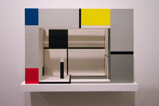
3D model by Piet Mondrian, Toneelmaquette voor ‘L ‘Ephémère est éternel’ van Michel Seuphor, (1926; reconstructed 1964).
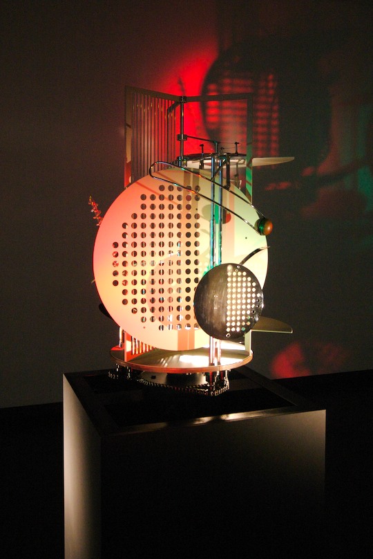
Ha, at first I was like, wow they have that famous kinetic sculpture of Moholy-Nagy’s that Vjeko talked about but of course I’m here when it’s not working because there are no lights on and nothing’s moving and wait a second there’s a small swtich at waist height in the hall that says push and ha no way, disco time. Light Room Modulator, 1922-1930. This one was a replica from 1970: metal, wood, glass and ‘elektromotor’.

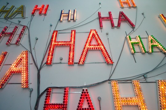
HI HA, 1992, by John Körmeling. Large array of coloured lights on a wall at the top of the gallery. Lights like you’d see on a fair right, sort of novelty-jewel shaped.

Another view out of the museum to the attached restaurant below.


The room itself was breathtaking for a minimalist lover like me. I couldn’t read the documents lightboxed along the walls, but the temperature and lighting was enough to soothe and yet excite me. Not to mention the €50,000 behind glass. Maria Eichhorn, Maria Eichhorn Aktiengesellschaft, 2002.
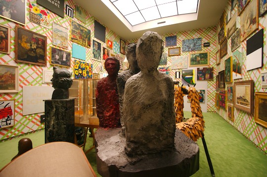
This Plug In exhibit by guest curator HW Werther was a curatorial experiment in displaying everything in the permanent collection at once but excluding certain works based on some sort of algorithm.
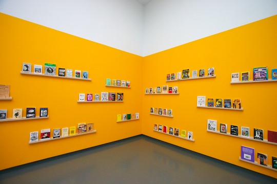
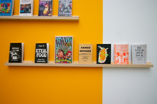
This room was displaying counter-culture books like How to Steal Food and Native American Anarchism.
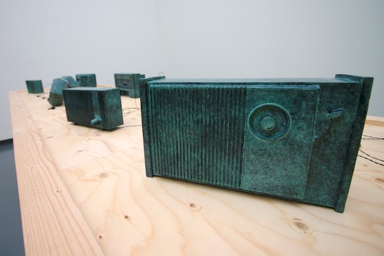
Radios carved from stone.

This one’s for you, Tobias.


View of the museum from the café.
Becoming Dutch and Other Exhibits
Comments
2 Responses to “Becoming Dutch and Other Exhibits”
-
Interesting descriptions of the various artwork pieces, your choice of words is really great. The radio stones and backward typography are just too cute! :)
-
although certainly a forceful painter, the dutch artist Charley Toorop was not a man, but a woman -and what a woman!
Leave a Reply