
The 2010 Emily Carr University Graduation Exhibitions. Nice vinyl on concrete outside the Granville Island campus. The whole show was pretty well branded, from the name tags to the labels to the wayfinding to the print catalogue.
I made a quick run around the Design exhibit at this year’s Emily Carr grad show. The following are some of the works that stood out on a gut reaction for me. Note: I only made a cursory glance at everything, and any image quality or distortion are a fault of mine, not the student’s. Also note: I’m a 2009 Design Grad from the same program.

Brian McBay’s Chewing it Slower. One of the conceptual highlights of the show, Brian was interested in making objects more physically interactive, requiring from us more touch and feel and to appreciate how they function. This is his accordion speaker, which you compress or expand to change the volume (as opposed to turning a plastic knob). Not pictured: his flyswatter with extended handle and small head; the xylophone doorbell. I should also mention Brian’s a close friend and I got to see his project mature over the past eight months.

Lorenzo Giuffrè and his lighting concepts. Looking forward to seeing these in action with his client–the 221A Artist Run Centre. Funny thing about that: Brian McBay, 221A Director and Lorenzo’s client, is also a graduate this year (see above). Note: I’m a 221A Board Member…also cool to see the process of consultation Lorenzo went through to arrive at his final pieces.

Melle Hong’s Chatspace. I just liked the look of these (chat avatars?) on the table.

OK so this a collage I made of the at least 8 projects where students invented some sort of online social networking service for a niche (and not so niche) market. I generally skipped past these as most were concepts and not operating, and dang if that isn’t a saturated field to tackle and come out with something original and thought provoking. What’s more valid and interesting to me is the fact that there were so many projects like this: it’s a big issue that people are intrigued by. I just hope for more critical looks at them. Or: something simple and hilarious. Imagine if Chat Roulette was a student design grad project. If it made it past the professor filters oh man I’d applaud the shit out of it.

Carmen Bright’s Neighbourhood Stories. I love anything local, and this was one of the few projects I’d actually like to use. The glass jars with flora/fauna and rocks were inviting, too.

I think this is (Jared’s?)Ryan’s piece, a community bike program. Wasn’t sure about the actual bike and system prototype, but the poster was nice. Everyone was printing on this new (vinyl?) material: matte and satiny and sturdy.

Mircea Juverdeanu made something called The Proæsthetic Project, a sort of flashy limb system. Very eye-catching: the dude has got aesthetics down and made great progress by returning to Emily Carr for a fifth year.

Angus Wong made this sofa. I heard he got the upholstery outsourced and it shows: very well done. Noticed a lot more outsourcing this year: another guy had his door design professionally skinned; another’s father operates a furniture factory in China and had her entire piece manufactured and shipped over.

Sophia Meyer’s Spread the Love. A table of full of temp-tattoos.

Sara Ahn’s Embrace. Enough design and photography and type treatment to not just be a straightforward editorial mock-up

Fugue in F Major by Rinat de Picciotto is a book on the explorations of equality. Great editorial image on the cover and one of the most professional looking–and professional content–Communication Design projects in the show.

Melody, a room partition (I’m pretty sure) by Stephanie Sauvé. Oh wait the label says acoustic partition, and the very thick felt-looking fabric in a flexible wood frame system is an eye catcher.

Adam Lupton’s Time. Big black 2D install on the wall, plus a book.

Ande Kuric’s Objective. Hand drawings, great style.
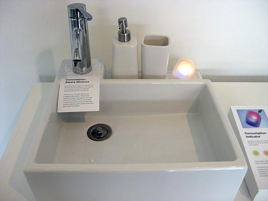
Jacky Ling attempted the visual display of sustainable information thing with his ATTN PLS ! Sustainable Interactives. I think the rock glows depending on water use/waste, and Jacky had some interactive iPhone/iPad things going on. Hesitant about undergrads developing huge systems, and this didn’t seem to bring too much new to the saturated genre, but if anyone can pull it off it’s Jacky. Will look closer at it next week.

Kyung Sun Yoon The Visual Flaneur. I think the infographic–unless it was just a display of her internal research–could have been more immediately descriptive, but again I’m an advocate for anything neighbourhood-based (as opposed to say, designing a new system for an entire nation). And flaneuring comes up in my life a lot; it’s like, an important topic people are rediscovering a hundred years later.

Albert Law’s Yakima appears to just be photos of army people and their weapons. I take it he’s in the Reserves? I didn’t see the critical or CommD aspect in this, but the photos were BIG.
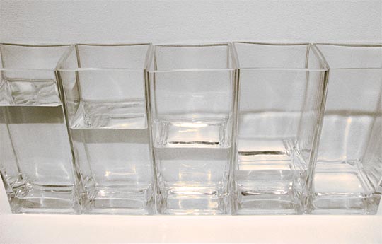
It was hard to photograph Fiona Cheng’s Respect Water and do it justice, but it was a calming and elegant display.

OK so it looks like Shawn Choi and Seeun Kim are envisioning a Vancouver Olympics in 2030? I’m probably the most interested in learning more about this project, but I already like the potential for subversiveness, and the 16 minute (16!) South Park-esque animation they made to accompany it. I briefly heard something about a stadium being built in the Yukon and then a guy wearing a bike helmet on a news broadcast.
Stephanie Vache’s Gezellig, if you listen to her tell it, has a lot of depth…it’s about creating embedded devices for the elderly in transition to living in a home and dealing with memory loss (my interpretation). In addition to the huge quilt she built (with embedded RFID) some of the other prototypes in this large installation were beautifully constructed.

Could seem a bit showboaty and fluff to have a grass patch next to your screenprinted newspaper project, but Kimberly Sutherland’s Everybody / Nobody pulls it off, provoking thought with her title and this simple tagline alone.
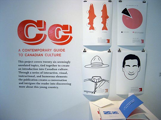
Tell me more, Jacob Kownacki, about your Contemporary Guide to Canadian Culture. Even if it turns out to be Coupland-derivative, I’m interested.

Dirk Wright and Cameron McKague, who I’ve had the pleasure of working with, are part of the select group of upcoming graphic designers in Vancouver. I’ll have to learn more about of Variation and Form so check it out and the vast array of material it’s composed of. Also just found out: they won the 2010 Farmboy Fine Arts award for their work.
Leave a Reply