Identity
-
Inner Worlds Imprint Logo
Publishing imprint, including optional variations for use:
-
Group W Logo
“Alternative” bicycle racing group with a motive for mischief wanted “bad” logo to match their ongoing bad design efforts to produce collateral and clothing designs for their new club and race series. Inspiration included obscure Woody Guthrie lyrics and trash (literally). Gave myself one hour, tops, to produce the whole thing from hand drawing, to various scan methods…
-
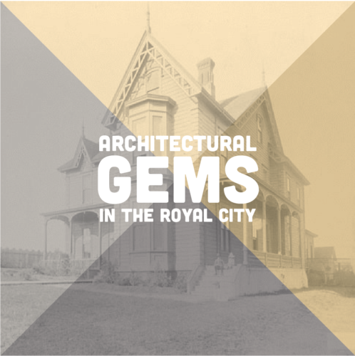
Architectural Gems Exhibit
Exhibit branding, marketing, and large format panel design and production for an exhibit at the New Westminster Museum and Archives. Working with the curatorial and install teams I was responsible for image selection from their archives, panel size, design, and materials, as well as overall look and feel of the marketing collateral.
-
Weaving Conference
Logo and wordmark for a 2017 conference of weavers in the Pacific Northwest. Of note, the client, the Association of Northwest Weavers’ Guilds (lovely old ladies), were very friendly and the most organized to work with—they approached the branding of the conference three years in advance. The brief included the pre-selected “Treadle Lightly” pun to coincide…
-
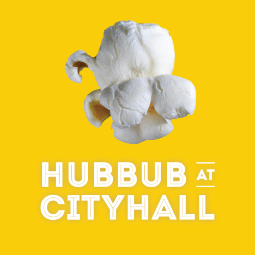
Hubbub at City Hall
Concept, branding and collateral for the end-of-semester exhibit and workshop for CityStudio, a non-profit education experiment that connects students with City of Vancouver staff on applied sustainability problem solving. With a budget of $200 and a one-month turnaround I developed the pop identity, a metaphor that plays off the kernels of ideas the students bring…
-
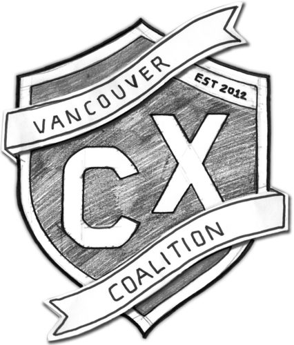
Vancouver Cyclocross Coalition
The newly-formed VCXC approached me to create a crest for their new cycling initiative. With a provided sketch and a couple evenings I iterated a number of wordmarks and monograms and developed them into a modernized heraldic crest for use on promotional posters, flyers and social media invites. The process involved hand sketching, scanning, digitizing,…
-
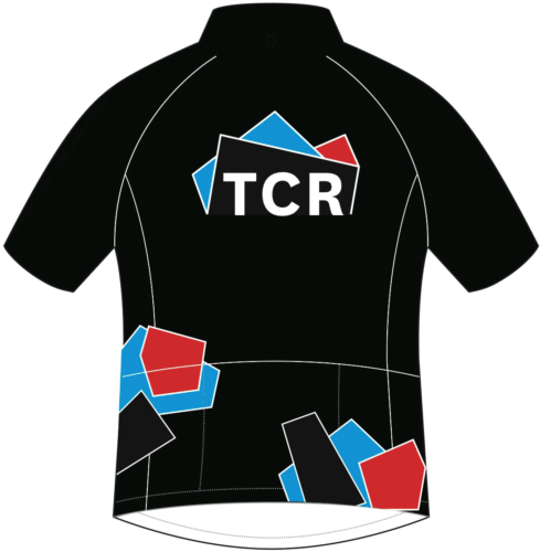
TCR Identity
Identity and applications developed for a local cycling team, Triple Crown Racing. From initial rides together to final vector files, approx. two weeks. Inspired by cycling racing colours of the 1990s and the profile of Vancouver’s notorious ‘triple crown’ mountains: Cypress, Grouse and Seymour. Vancouver, 2011. Part of the development process involved communicating remotely with…
-
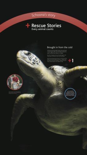
Rescue Stories
Marketing identity and exhibit graphics for the Vancouver Aquarium’s Fall 2011 promotion, Rescue Stories, highlighting the animals and work the non-profit has done in both rescuing, rehabilitating and releasing or caring for a variety of marine-based animals in its long history of conservation. Key to telling each animal’s story, many of which had resided at…
-

Big Ambition Campaign
Concept, design and custom fabrication for a bus shelter ad campaign. After securing a $37,000 worth of advertising budget from the City of Vancouver and CBS we created this parallel slogan and graphic identity to run in select shelter spaces. During daylight hours the official poster slogan reads “Small school big ambition” while at night…
-
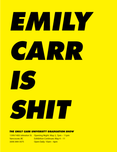
Emily Carr Says What?
Advertising campaign proposal for the university’s Graduation Exhibition. After securing $37,000 in donated advertising space we designed a series of two-part campaign posters. Short slogans appear to disparage, or have fun with, the school’s reputation. But when backlit, turned, or re-read new and improved slogans are revealed. Language translations were produced based on city demographics…
-
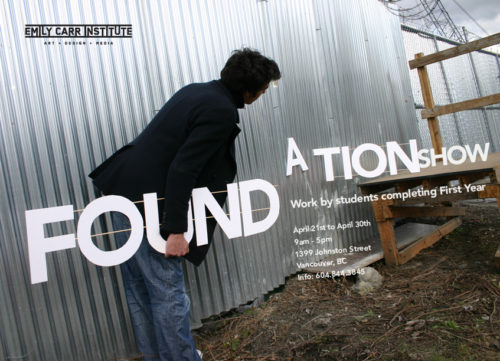
Foundation Show
Joint concept, design, printing and photography. Our four-person project was the winning entry in a juried competition to promote the University’s year-end Foundation show. A poster, series of flyers, wayfinding system, signage, and exhibition labelling were designed and produced. In collaboration with Tobias Ottahal, Amanda Huynh and Andreas Brœndhaugen.
-
Women’s Squash Weekend
-
Power Hiking
Logo design for personal trainer, Victoria, 2004.