It’s fun looking for ways to improve existing designs, critique them, look at solutions and drawbacks, etc. Then there’re the designs that warrant an immediate reaction. I want to start cataloguing instances that illicit a teeth grinding “What the Hell People!?”.
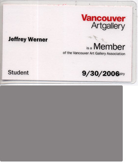
First up this week: The Vancouver Art Gallery membership card, which I recently purchased and received in the mail and cannot put in my wallet. It is one of those damn cards that is too wide. What the hell?

A VAG member card (top) and the standard (below).
My old-school Mountain Equipment Co-op membership, and my mini birth certificate, suffer from this, too. They don’t fit in my wallet’s slots. If I shove them in the main money compartment the wallet doesn’t fold in half properly, or the card sticks out the side for rapid wear-and-tear.
Cards (business, credit, debit, ID, etc.) are be about 9.5 x 6.5 centimetres.
Card Size Standards, People!
Comments
2 Responses to “Card Size Standards, People!”
-
Hum interesting topic, and it’s interesting that you mention the arts community. The ISO established the SC17 card standards long ago in the stone age (1988). In fact, some chump though this sort of information was so important to share they constructed a website http://www.sc17.com . Now for the rant, most banks and companies seem to graciously accept the standards. Governments should be forgiven, I believe they accept the standards, but just like all thing governmental do not want to rush implementation; a 20 year plan is fast enough. On the other hand, from personal observation it seems to be the arts community who regularly revolt against any and all standards for some sadistic artistic reason.
-
Dave, that is the most obscure, informative comment I’ve seen on here. Excellent.
Leave a Reply