The Family of Form exhibit at the Design Huis in Eindhoven, Netherlands is currently showing “works of three generations of graduates from Design Academy Eindhoven.” By three generations they mean over the past decade or so. Here are some of the pieces I documented with the English text copied from the show’s labels. Many of these pieces are what originally inspired me to attend the Academy myself this year.
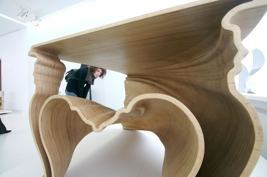
DeMakersVan, Cinderella, 2005, Design Academy Eindhoven, Atelier.
“17th and 18th century profiles of furniture are morphed into a fluid and organic form to challenge and develop the skills of the current computer engineering production methods, using a high-tech method as contemporary craft. The resulting table from birch plywood shows what is common to be overlooked: it is exactly in industrial production that our Cinderella’s are hidden.”
I’ve also been told Cinderella is created using a 5-axis CNC machine, and that the original prototypes, made here in Eindhoven, cost $90,000. I personally think Cinderella is brilliant.
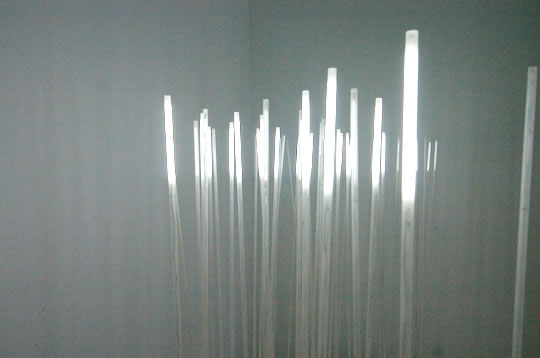
Simon Heijdens, Reed, 2002, Design Academy Eindhoven, Man and Communication.
“Nature has become rare in our daily life. The reeds translate outside nature to the indoor space, by slightly waving when a windgust passes the building, as measured by a windsensor that is connected to the reeds. The space regains the natural character that it has walled out.”
Although I didn’t like the sterile florescent colour of the light, this photo doesn’t do Reed justice either. Also, they were just over a metre tall I think, with small round lamp-like bases.

Chris Kabel, Sticky Lamps, 2001, Design Academy Eindhoven, Man and Living
“The indisputable, stylized interior model is replaced by our fast-moving modern lifestyle of constant change. This asks for designers to think as transformers and assess their own designs on the basis of their potential to re-form.”
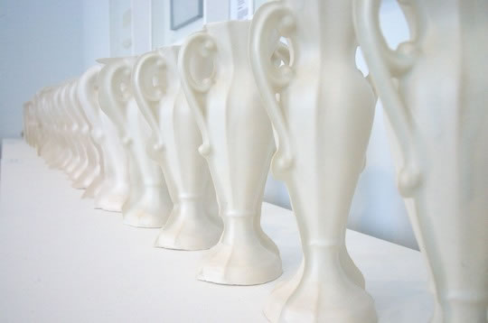
Joris Laarman, Limited, 2003, Design Academy Eindhoven, Man and Living
“Real value and meaning are always connected with necessity, transitoriness, and number. Laarman developed the first transitory mass production method. The ultimate limited edition is created by using a mold that erodes until a course of life appears in the form and which dies if the reproductions are not functional anymore. In this way it is a mass product, with a limit in the production process itself. Each step obtains its own character in a progressive family.”
What’s hard to see in my photo of Limited is how each progressive vessel deteriorates into an abstract form that is a collapse of the original.
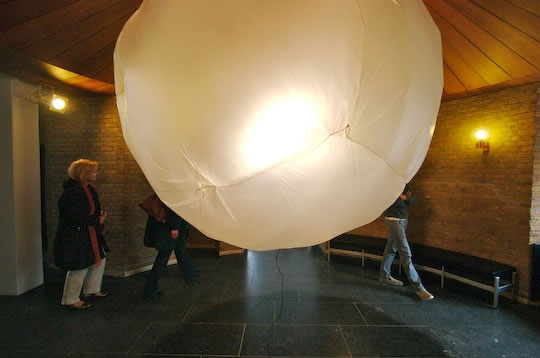
Erik Klarenbeek, Floating Light, 2003, Design Academy Eindhoven, Man and Identity.
“A lamp floating in the air like a soap bubble. A fragile and bright featherweight balloon is heated up by a single bulb to be afloat, filling the space.”
Like my friend and fellow student said, if its got plastic and sewing, I like it. While I didn’t really like the aesthetic of this piece, once I read the description about the single bulb heating it up, I do like the concept. There are works where the aesthetic is enough, others where the concept carries it along, then there’s the ones where the aesthetic hit you, you like it, and later you learn the concept and you’re in love. Cinderella and Smoke do that.
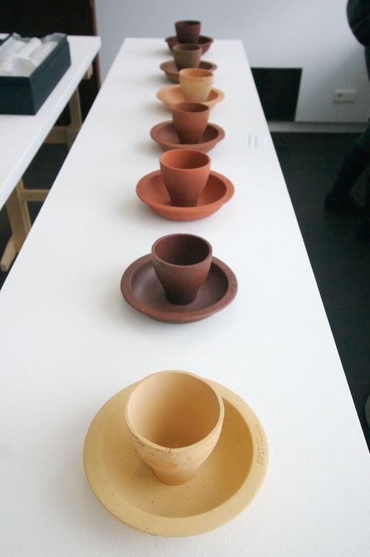
Lonny van Rijswijck, Uit de Kiel Getrokken, Design Academy Eindhoven, Atelier, 2006.
“Clay from the Netherlands is unearthed and simply shaped as cups and saucers to celebrate the beauty and variation in local colour and craft.”
My roommates, who are masters students at the Academy, and I were discussing what students spend on their grad projects. One girl they told me about spent €2000. Her concept wasn’t all that great, but the finished product was gorgeous and she ended up winning competitions and going on to a career in design. So there can be resentment of those with money to pump up their grad projects, and there are those that really just go for it and their investment better realizes their dream instead of just sugar coating it. Then there’s Rijswijck’s piece. My roommates tell me she didn’t spend a dime on her project, which collected clay from various regions of the Netherlands and fired them in the school kilns. Ahh simplicity in form and story.
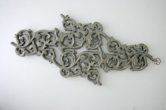
Joris Laarman, Heatwave, 2003, Design Academy Eindhoven, Man and Living.
“A heating radiator that unites functionalism with exuberant postmodernism. The decoration is essential, since a greater surface area will emanate more warmth. Now part of the Droog collection.”
“Essential” as part of the beauty in function is pushing it a bit, to me. It’s really just perty. This is also one of those pieces, I told my friend, that I both myself AND my Moms would like. A common ground for us to appreciate what design is without having to get academic about it.
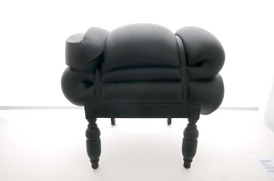
Frank Willems, Madam Rubens, 2004, Design Academy Eindhoven, Atelier.
“The hand-made Madam Rubens, a self-forming stool made from recycled mattresses and antique chairs is but one piece in his collection which brings ordinary unrelated objects together.”
This was the first time my friend and I had seen this piece. We loved it. How can you not: it’s so squishy yet black-stylin’. It’s art. You could, in the gift shop, buy it in other colours. While my friend said no way, it has to be black, which I agreed if I was to own one, I think a series of colours in a like, a waiting hall or gallery, would be great. And I think only in a series, in a setting encouraging sitting, would I sit on this. Alone, in black, it’s only for the eyes, not the ass.
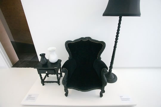
Martin Baas, Smoke, 2002 (?) Design Academy Eindhoven, Atelier (?)
I didn’t get the label info for this one, probably because, well, you know it’s Smoke by Martin Baas. For those that don’t know, Baas took old furniture, stuck it an oven till it got a nice burnt patina all over, pulled them out and epoxied them (I am told), reupholsters them and there you have one the most beautiful and famous pieces (and now designer) to come out of the Academy. Perhaps above all (along with some earlier Droog stuff) Smoke is what made me think how simply beautiful and unencumbered design can be.
Someone else also told me that the production runs of Smoke use new furniture made like old furniture and then burnt.
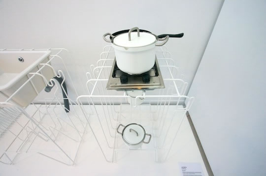
Jan Dijkstra, Kitchenette, 2005, Design Academy Eindhoven, Man and Living.
“A family of four kitchen models inspired by only one element: this wired kitchen is serial and functional and can be used separately or in combination: a sink, a workshop, a cooker and a washing space.”
I’m somewhat undecided on both the look and concept of this one. I like exposing things, which is a popular theme these days as a satisfying response to, and in order to demystify, technology, but hmm, maybe I just feel a bit unstable when I look at Kitchenette. Also see below, Nude.
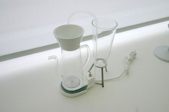
Mieke Meijer, Nude, 2006, Design Academy Eindhoven, Atelier.
“Transparency was employed to unveil the inner workings of a twin-set coffee machine. Revealing the innermost secrets of the coffee making process, Nude is a credit to its name. Bare essential and stylized simplicity make it an honest product.”
I told my friend this piece appealed to the nerd in me. She, not a nerd, liked it too. I would like to both look at and use this one. Just remind me, when I talk about my designs in the future, as fun as the language can be, to watch out for phrases that say I “employed” something like transparency to show the “secrets” of like, a toilet or something. With a design like Nude, the caption could follow its own admission: keep it bare and essential. How about: Meijer shows the inner workings of a working coffee machine.

Nadine Sterk, Sleeping Beauty, 2006, Design Academy Eindhoven, Atelier.
“A lamp that develops like a living organism: switch it on and it slowly starts growing by knitting its own lampshade at a speed of three rotations per hour.”
I was excited to see this in person, having just discovered it in a grad catalogue a few weeks ago, when my roommates and I agreed it’s a great concept. In person it was smaller in diametre than I expected. I was also surprised it was made by a woman. I suppose my sexism assumed the technical machinery of Sleeping Beauty (and any steampunker or techie would like this one, including its RadioHead fridge-like buzzing) meant it was created by a man. My friend, a girl, countered: it’s knitting, of course it’s by a girl.
Leave a Reply