Assignment 2, SOCS-217 Ergonomics I
Consider an existing device/product and apply ergonomic principles to determine and suggest possible changes to its physical characteristics.
But really I made this an exercise in graphic design. Super fun and learned some more about complex style sheets (logic of nesting is a lot like CSS) and tables in InDesign.
Download the screen-res PDF [480 KB]. Screen grabs below.
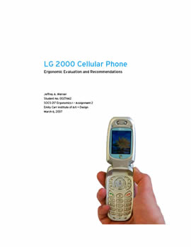
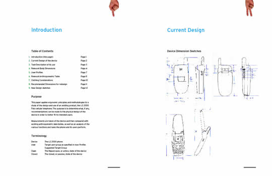
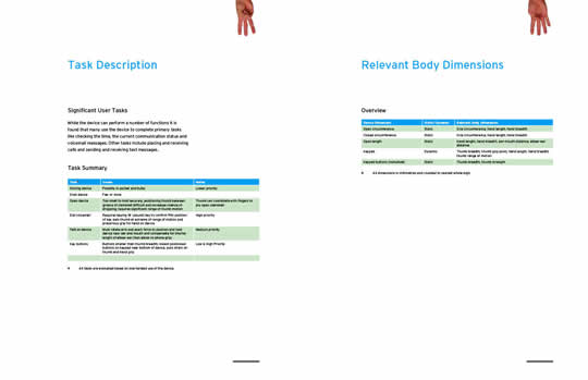
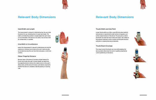
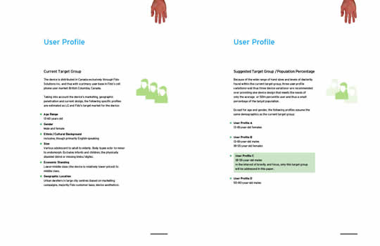
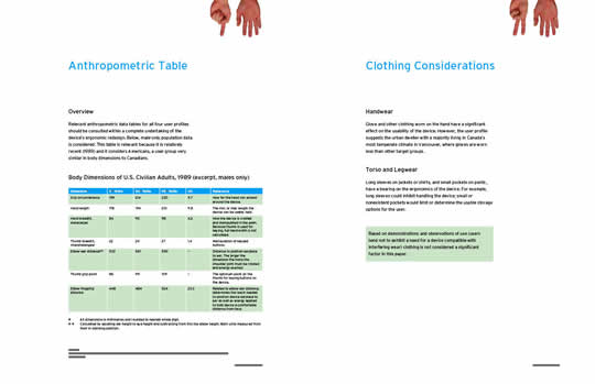
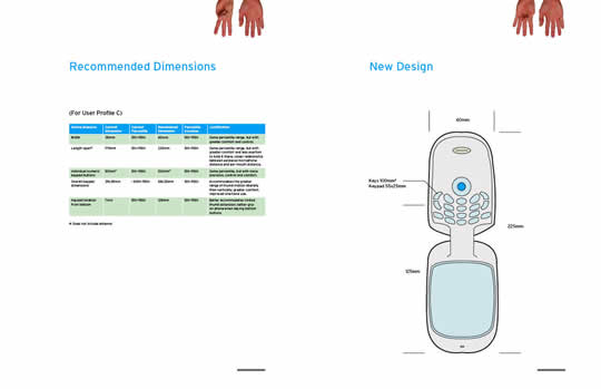
Ergonomics Report
Comments
3 Responses to “Ergonomics Report”
-
Nice job Jeff. It looks great.
I like the finger page numbers. Minor quibbile: I get annoyed reading pdfs where the printed page numbers don’t match the real page numbers. Isn’t the cover typically considered page 1?
The tables look good. I like the alternating green and white breaks. The photos and graphics also look great. Excellent job seperating them from the background.
Since the asthetics are so good I figure I’d mention that the skin tone in the picture with the arm is a bit different and sticks out a bit. Not a big deal though. Great work. -
Ya, you’re the second person to point out the page and finger number descrepency. IE Page 12 in the footer text should be page twelve in the header fingers. Not sure about cover being page 1: in a report of this nature I would say no?
Ya, you’re right. I’ll fix that skin tone (me so pasty). -
Jeff,
From an ergonomics perspective – the report looks good. I’d love to have cell phones that were more ergonomically suited to individuals, instead of the mass produced nature that they are presently.
Leave a Reply