As a way of communicating with our design team concerning the Halloween Cabaret we’re organizing, I’m posting our poster concept for people to comment on. Check out what Tobias put together tonight using some of the photos from our shoot, and please post a comment about what you think:
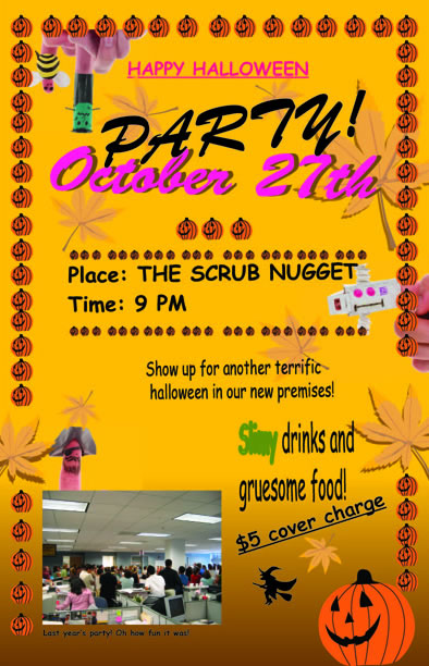
The “poster”.

The poster.
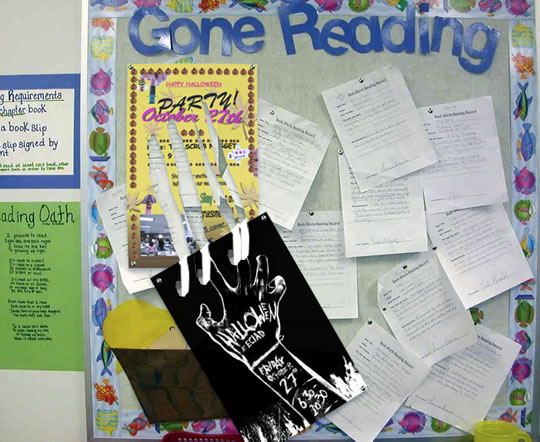
Variation A of how we would post them around school.
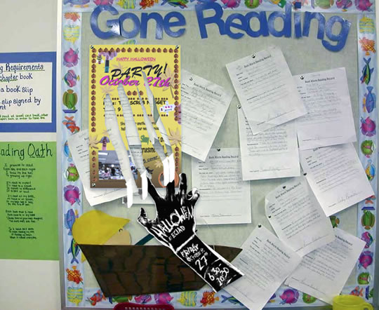
Variation B of how we would post them around school.
As discussed at our process meeting last week we’ve got the “poster” with the hand puppets and all that, then we tear actual scratch marks into them and place the second, real poster just below.
My second thought was that we would go with just one concept and one poster, i.e. a stand-alone hand puppet poster without the scratching and second poster below. Like, have 10 or so posters each with a different hand puppet featured on them.
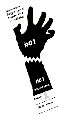
Finally, here’s the raffle ticket design I made tonight:
Halloween Design Concept
Comments
14 Responses to “Halloween Design Concept”
-
Oh, Christ.
I think the “poster” is frightening enough on its own.
This is a compliment to you and Tobias – you HAVE to be good designers to be able to break all the rules so well. -
It’ll take a lot of paper but this caused me to have a reaction, and that reaction was “Whoa. That’s pretty cool.”
-
I like variant B the best.
Also, the ticket thing is awesome, and you can put your name/email in case you aren’t going to be there later/can’t hear it being called? Delicious! -
Oh my. The poster is cutesier than I ever imagined. Pretty much perfect.
And I feel like Variation A is bolder and a lot more noticable… but B looks cooler. If we post on blank walls then B would be great, but if it’s like the photo on busy bulletin boards, A will stand out more. -
Awsome.
I agree with Anne, what with the blank walls as opposed to bulletin boards. -
Oh, I guess I could’ve given a more constructive comment. I like the A idea still.
It’s like WHEN POSTERS ATTACK! -
Hahahahaha…good, the comic sans font.
Yeah, I think all the constructiveness has already been said… -
Gotta love those clip arts, lol.
I like variation A, feels more solid.
Variation B feels a bit more flimsy to me. -
where the heck is this idyllic little reading corner you’ve terrorized? :)
FABULOUS work as per usual –
I prefer option A too- maybe with the hand poster covering up the first poster a little more? And option B if the hand is alone somewhere.
Also – maybe Kim has said something already but should the hand have a little more info on it? i.e. ECIAD CAFE, Costume Contest, no cover . . .
I love the little bone on the raffle ticket:) Is the 6:30 time when the winning ticket is going to be drawn or is it just a handy (har har) reminder to attend the event? and if it’s a reminder- should it have the location (though it’s probably obvious) & is there room to make the name/ email part longer maybe? -
variation A gets my vote – again with the noticability factor. thumbs up for the great design guys!
-
another quickie for the raffle ticket: are the prizes already known? should they be listed on it?
and financially – though the current comic sans poster is so inexorably perfect – would it be much more cost effective to print a smaller version twice on one 11 x 14 color sheet & cut it in half for two? -
I’ll vote for poster A as well, gots to love this finger puppets! Good work guys!
oh, and great choice of font as well, comic sans all the way! -
Theft is the sincerest form of…
An open letter to the Alma Mater Society (Student Society) at the University of British Columbia. To assist@ams.ubc.ca, marketing@ams.ubc.ca: Hi there, I’m a student at the Emily Carr Institute in Vancouver. It was recently brought to my attention that…
-
Buy viagra.
Viagra. Viagra pictures. Re viagra cello.
Leave a Reply