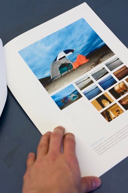
I’ve taken my exchange application portfolio that I put together three weeks ago and tweaked it for an institute-related summer internship I was interviewed for today. Some sample shots taken just before my time slot this morning:
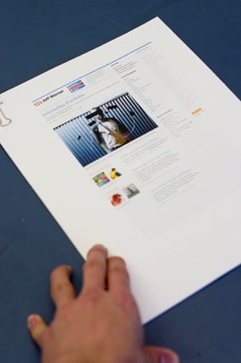
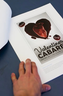
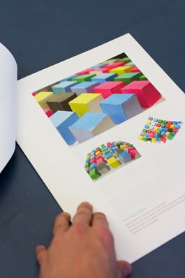

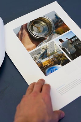
Download Jeff Werner Internship Portfolio March 2007 (screen-res PDF, 979 KB).
I’ve added a couple more entries to do with my video work and combined a couple of the process pages. There is now basically one project per page. I’ve also reduced the written descriptions (as I was showing the portfolio during the interview), clarified my responsibilities and printed it single-sided ($20 colour laser at InPrint) and bound with a small, silver bulldog clip. Also, portrait orientation, extra margins on the left for flipping, less obtrusive type.
Interesting how, despite catering this portfolio to a particular situation and audience, I actually prefer it as my main portfolio. I’ve learned so much revising and revising. Even after three weeks I’m still discovering things I dislike about the exchange application and pieces I want to swap out, works I’ve forgotten about.
I’m learning what really interests me, and the currents that run through my work I was not even aware of.
For the next iteration:
- Top quality printing with Carlos
- Some sort of system that allows me to swap pieces in and out?
- Right align that little blue arrow
- Easy to convert landscape PDF version with hyperlinks and video embedded?
- Clean up images
- Opinions about written descriptions
Leave a Reply