The following are four drawings I’ve done–and kind of like–since I started my first sketchbook nearly two months ago. Comments, critiques and advice are encouraged. I’ll try to make this a regular feature on the site.

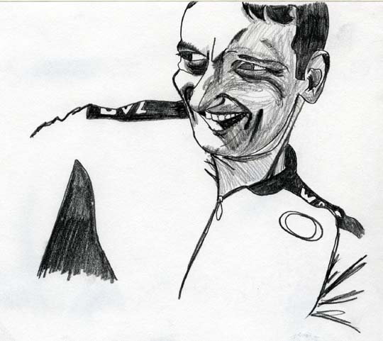
Drawn from a photo I took of a bike racer friend. Features are a little over-pronounced.

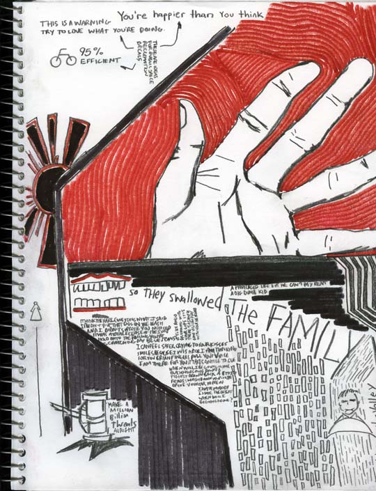
My first use of color. I started with the slogans in the top left, then did the thick black borders and gradually doodled in the rest while listening to the band Xiu Xiu, mixing lyrics with my own thoughts. It was all mainly stream-of-conciousness. I was going to use green and yellow for the bottom and sun, respectively, but found the green clashed and the yellow weak, so stuck with black and red. The red marker was cheap and dried and left a kind of waxy, half-faded line, so I tried to work with that to create the texture around the hand. I also had this urge for verticality in the bottom right. The sun and gavel (bottom left) seemed out of place by the end.

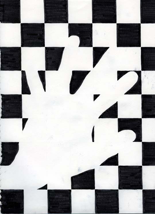
I wanted to try working with negative space to define an object. I didn’t challange myself enough, though: I traced my hand and used a ruler to outline the grid. Filled in with a black marker.

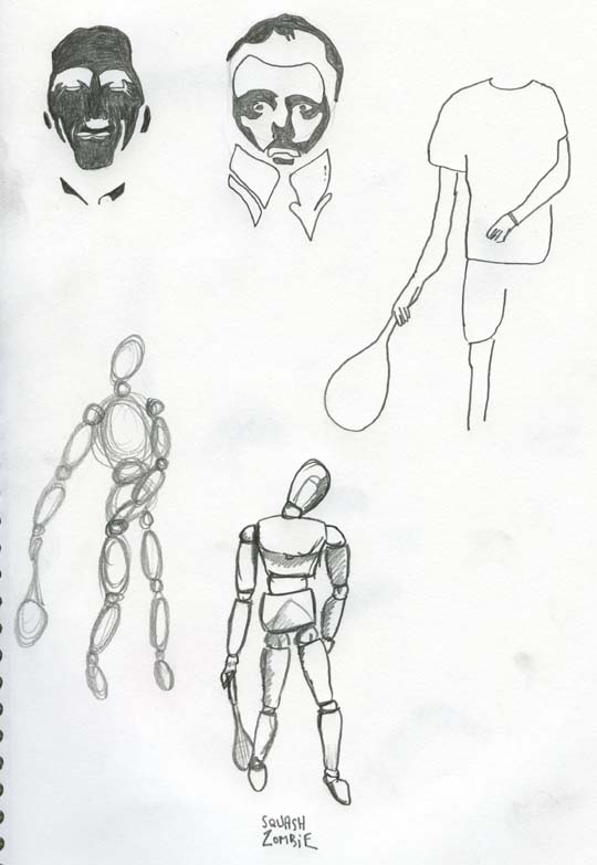
I’m writing an article about being a squash zombie. Top left is a drawing of a photograph of myself (I had previously worked the contrast and levels on the photo to look like a two-tone stencil). Next to that is a drawing of an illustration from the film Shaun of the Dead. Drawing an actual zombie was difficult, so I tried posing an artist’s wooden figure in lumbering, half-dead posture, and will try and work that into a figure of myself, with blood and drool and bits of brain on my lips, of course. That’s the plan anyways.
Sketchbook Scans
Comments
3 Responses to “Sketchbook Scans”
-
I like the 1st two.
-On the 1st one the left-hand side of the face (eye + check esp.) look more cartoonish than the rest.
– On the 2nd, I like the fingers on the hand. They are deformed and bizarre. But the thumb and lines on the palm don’t fit. The thumb is too normal and the lines seem awkward. -
J’taime the valley, OH!
-
Ok, some opinions and ideas:
I like the 2nd drawing a lot too. Makes me think of a Communist poster (Chinese or Soviet, you pick). Why don’t you go crazy on these things with Photoshop and Illustrator?
1st drawing is pretty cool too, but it made me think that it would be pretty cool if you played with it in photoshop or something too. Another fun thing to do with drawings is if you print it out low quality on some 8.5×11 and use some trace paper or normal printing paper to trace over it really roughly with a jiffy marker or just some brush and ink. Then scan it back in and superimpose on the original drawing and play with the opacity, or different effect like making the lines totally solid or cranking up the contrast even more. I figure that you probably have some good skills in photoshop as well that you could show off by combining them with your drawing skills as well, but I always like to see more of the drawing than the photoshop skills (I.E., be sneaky about using photoshop).
Drawing three is a good exercise negative space, but the other three would be better for directions for your portfolio in my opinion.
Drawing four is a cool concept. Now that you have the body forms, why don’t you get a tall mirror, act like a zombie, and draw it? what about making it into a storyboard or something?
Leave a Reply