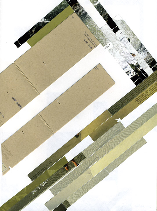
Inspired by Robert Dalton’s work, currently on exhibit at the Maltwood Art Museum and Gallery. I wanted to understand why I liked his magazine collages, and felt an exercise in colour composition would help me figure it out. This piece is cut up from a shoe company brochure and a Gap jeans tag I have in my pile of packaging and print designs, and pasted. I definitely wanted a diagonal composition (the particular piece I liked of Dalton’s was diagonal). Starting with the bottom right, I originally wanted to fill the page, but felt the perpendicular, darker stripes–and more white space–helped emphasize both elements better. Wanted to include the neutral beige and thick tactility of the Gap tag without overpowering the piece. By the end it also reminded me of Muller-Brockman.

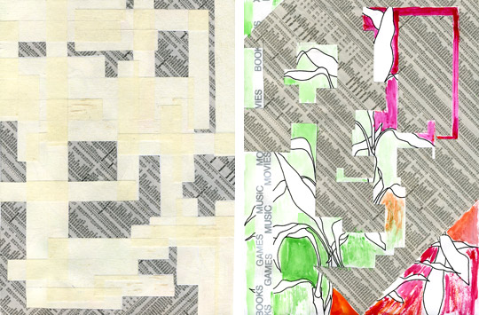
After the collage I wanted to try masking tape (left), hoping its texture would look cool layered, and maybe colouring it would bring that out more. It ended up kinda bland (this scan looks even better then the actual piece). After leaving “windows” of white space and not knowing what to put in them, I traced their outlines in velum then painstakingly cut them out over stock reports from a newspaper, and then pasted those in.
Left with the cut-up stock page, which looked cool on the wooden board I was cutting on, I pasted it onto another page, which looked less cool. Had wanted to do something with the strips of plastic-with-silver-writing I cut up from a shopping bag, so added those for verticality, then drew in some leaves from my bamboo plant. Thought I’d try a little watercolour for emphasis and further colour experimentation: didn’t go so well.
Sketchbook Scans: Collage
Comments
One response to “Sketchbook Scans: Collage”
-
These are very pretty. I’m all about diagonal lines. Especially ones that are perpendicular to each other. Also anything made with tape is awesome… tape is my favorite material.
Leave a Reply