Featured
-
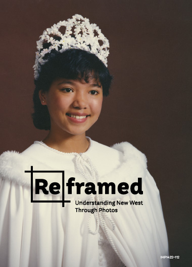
ReFramed
Design of the 2025 exhibit “ReFramed” at the New Westminster Museum, featuring stories of under-represented communities told through photography from the museum’s archives. Working with the curator and the museum’s fabrication team I created the layout and designed the wall-to-wall murals, camera and artifact displays, an interactive photography studio, as well as all the graphic…
-
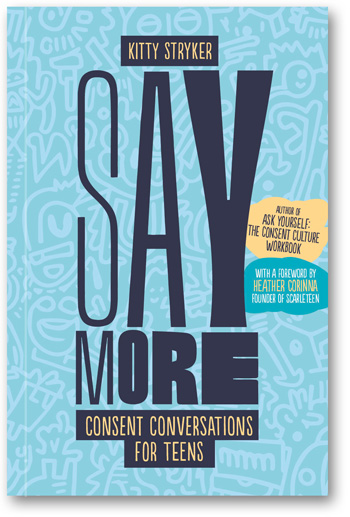
Say More
Cover and interior design, published 2024.
-
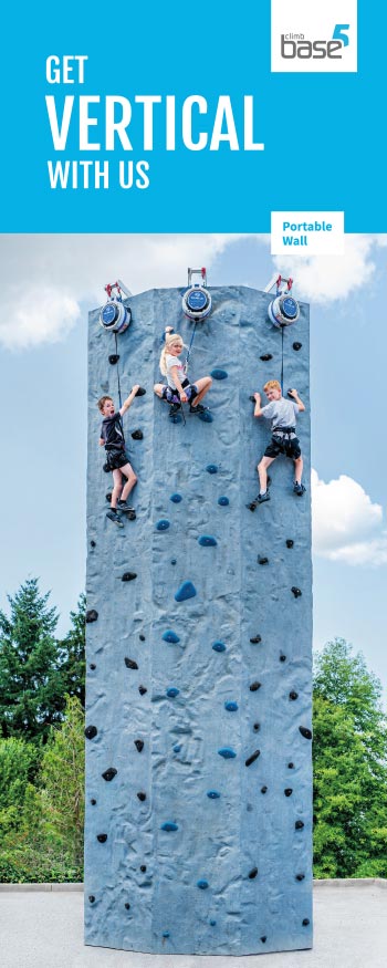
Base5
Brand rollout and marketing design—brochures, cards, posters, stickers—including an full revamp of key print materials to align with the gym’s new branding and branching out with single-use or short run promotions. For both gym locations in Vancouver, Canada. 2019–ongoing.
-

Quintuple Motherf*cker
Annual non-profit group ride I organized over the five hardest paved climbs in a single bike ride of 180km and 4,000m of elevation gain, in Vancouver, Canada. 2013–2020. Event marketing via social media—Instagram & Facebook—a different theme each year.
-
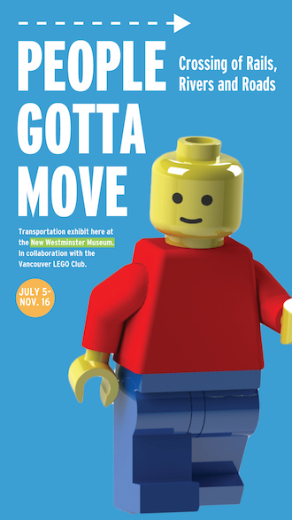
People Gotta Move
Exhibit graphics, branding, and marketing for the New Westminster Museum and Archives, including digital and print billboards, banners, posters, and full wall-wrapped interpretive panels. 2018.
-
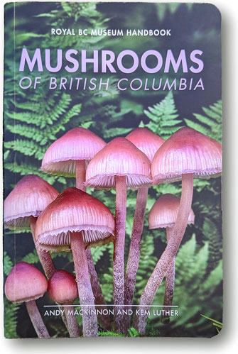
Mushrooms of BC
Re-design of decades-old and divergent templates for the Royal BC Museum handbook series, culminating in the jewel of the guides, Mushrooms of British Columbia. In the 30+ years since many of the museum’s handbooks were published advancements in printing, photography, workflow, and digital formats means a small team—myself in design, an editor, two authors, and…
-
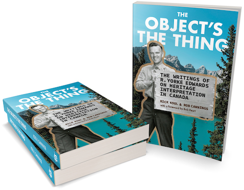
The Object’s The Thing
Cover and interior design, incorporating archival image editing and the use of multiple text and layout styles to distinguish historical, interpretive and contemporary writings. May 2021, paperback, 336 pages Almost everyone who has visited a Canadian park or museum has been touched by Edwards’s legacy—but few know his name. Through essays and photographs, a biography…
-
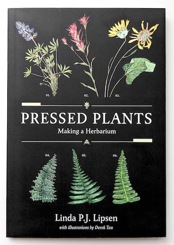
Pressed Plants
Cover and interior design. Text by Linda P.J. Lipsen, with illustrations by Derek Tan. February 2023, paperback, 104 pages.
-

DB Power
Brand and collateral design for a small business launch. Simple and effective, particularly for the owner/operator to implement on their own, in the saturated outdoor powersport market of Kelowna, Canada.
-
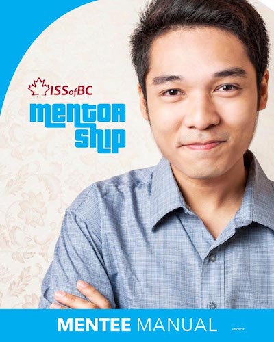
Mentor Guides
Series of three guides, colour and image-themed for quick identification. Developed for the non-profit Immigrant Services Society of BC and their mentoring program connecting students, staff, and businesses in Vancouver, Canada. Branding, font and icon selection, layout and print- and screen-ready booklets. A single file for each guide can be purposed by ISS staff for…
-
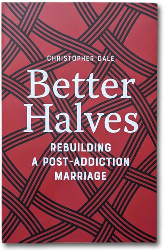
Better Halves
Interior and cover design, with flaps and decorative chapter motif. 5.25″×8″, 280 pages. Published November, 2022.
-
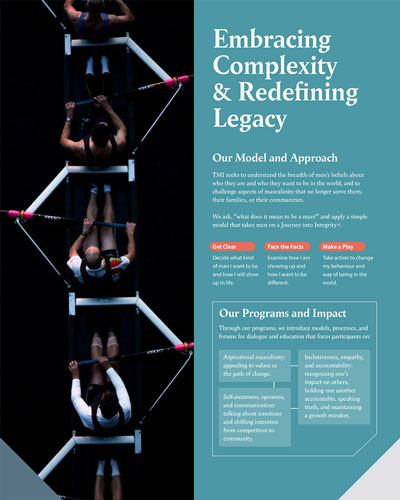
Men’s Initiative
Develop a new look & feel for an initiative founded at the University of British Columbia, starting with their 2020 Strategy and Business Development documents. Selected imagery, fonts, and colour palette. Exported for print and screen. 2020.
-
Action Plan: Zero Plastic Waste
-
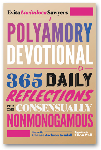
A Polyamory Devotional
Cover and interior design, with illustrations by Tikva Wolf, published 2023.
-
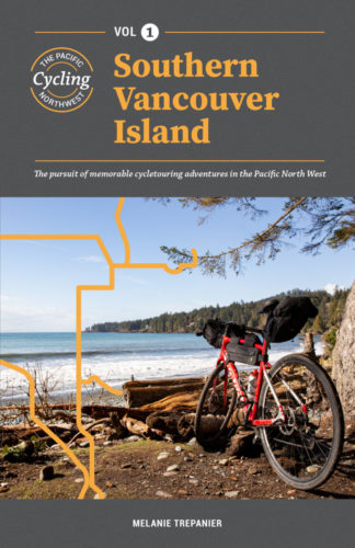
Cycling the PNW Vol 1
Cover and interior design.
-
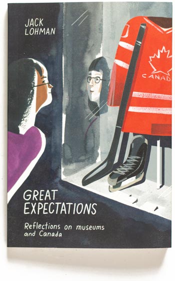
Great Expectations
Cover and interior design. Matte jacketed paperback cover, footnotes, index. Cover and interior illustrations by Ping Zhu. Published September 2019, 240 pages.
-
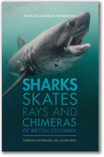
Sharks
Cover and interior design. Sharks, Skates, Rays and Chimeras of British Columbia is also first in a series I was commissioned by the Royal BC Museum to develop featuring a new graphic and layout template for their revised handbook and field guide series. Published May, 2020, 232 pages.
-
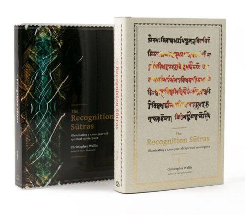
The Recognition Sūtras
Cover and interior design, including foil-stamped jacket and binding, soft cover edition, and ebook. Font selection and treatment was particularly challenging with multiple character, diacritic, and unicode support. Working from scanned manuscripts, to Microsoft Word documents, to final InDesign layouts introduced a variety of new and surprising technology hurdles (font variants make even copy-pasting an…
-
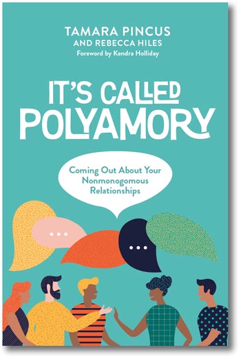
It’s Called Polyamory
Second printing and new cover & interior design, typesetting, print production and ebook. Variable graphic motif for chapter headings. Paperback version 5.25″x8″, 208 pages, ebook in enhanced epub and Kindle formats.
-
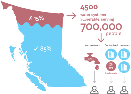
BC Water & Waste graphics
For the British Columbia Water & Waste Association pilot report, a set of vector info and theme-based graphic treatments and templates for current and future published reports, including a brand guide with typography, icon, and colour selection.
-
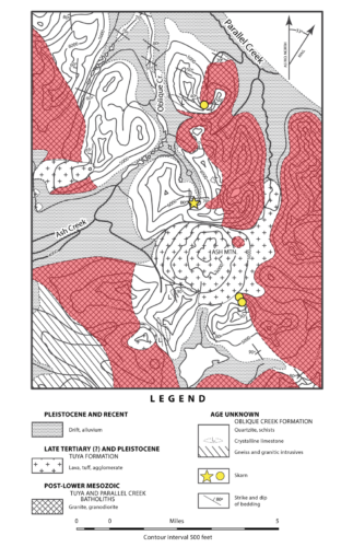
UBC EOS Map Rebuild
Vectorize and overlay new data for a mapping project with the University of British Columbia’s Earth and Ocean Sciences department.
-
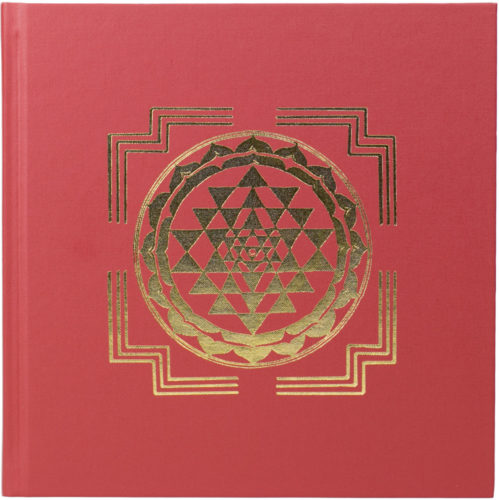
Goddess and the Guru
Cover & interior design, from concept through to printing and ebook. Foil stamped jacket and cloth binding, two-colour printing, nearly 400 margin notes, tipped-in end papers and author-signed pages, and full-colour photo inserts. Both limited edition hardcover, and softcover. Published 2017, 8.25×8.25 inches, 416 pages; epub 3.0 and Kindle enhanced.
-
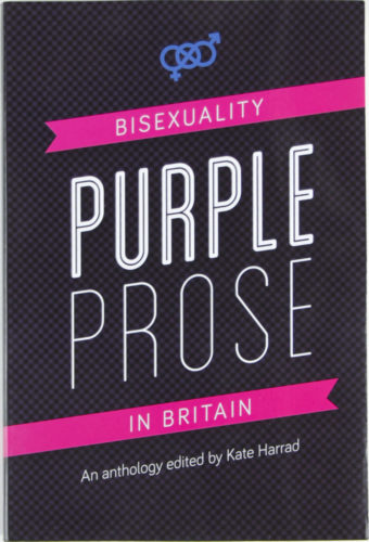
Purple Prose
Cover, interior design, print production. Published September, 2016, 352 pages.
-
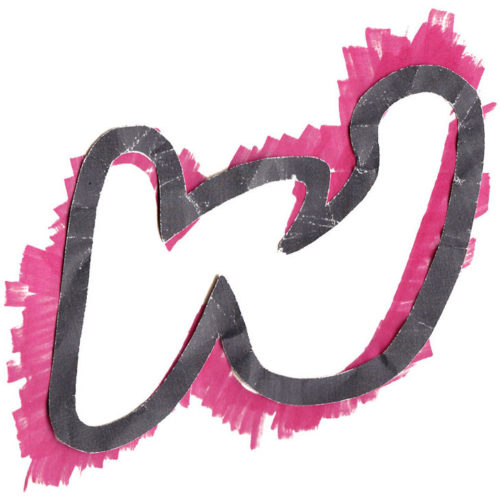
Group W Logo
“Alternative” bicycle racing group with a motive for mischief wanted “bad” logo to match their ongoing bad design efforts to produce collateral and clothing designs for their new club and race series. Inspiration included obscure Woody Guthrie lyrics and trash (literally). Gave myself one hour, tops, to produce the whole thing from hand drawing, to various scan methods…
-
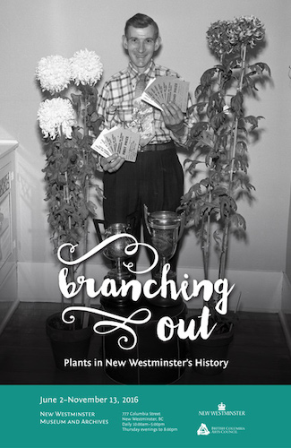
Branching Out Exhibit
Exhibit branding, marketing, and large format panel design and production for an exhibit at the New Westminster Museum and Archives. Working with the curatorial and install teams I was responsible for image selection from their archives, panel size, design, and materials, as well as overall look and feel of the marketing collateral. Exhibit posters. Exhibit cards…
-

Saddle Bag
Design, testing and production sewing of a compact under-saddle cycling bag in over 500 units and 20 colourways . Snugs up tight, compact, discreet: no sagging sack under your ass. Holds an inner tube (up to 700×35), tire levers, an energy bar and a multitool. Cordura outer with hook & loop closure. Reflective tag faces behind you, offset to avoid…
-
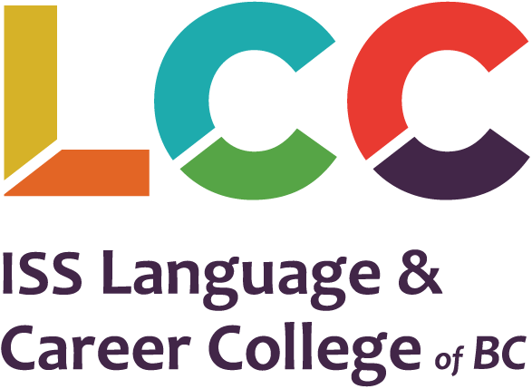
LCC Rebrand
Rebrand with new colour palette, logo and print & web themes for the Vancouver-based non-profit Language & Career College.
-
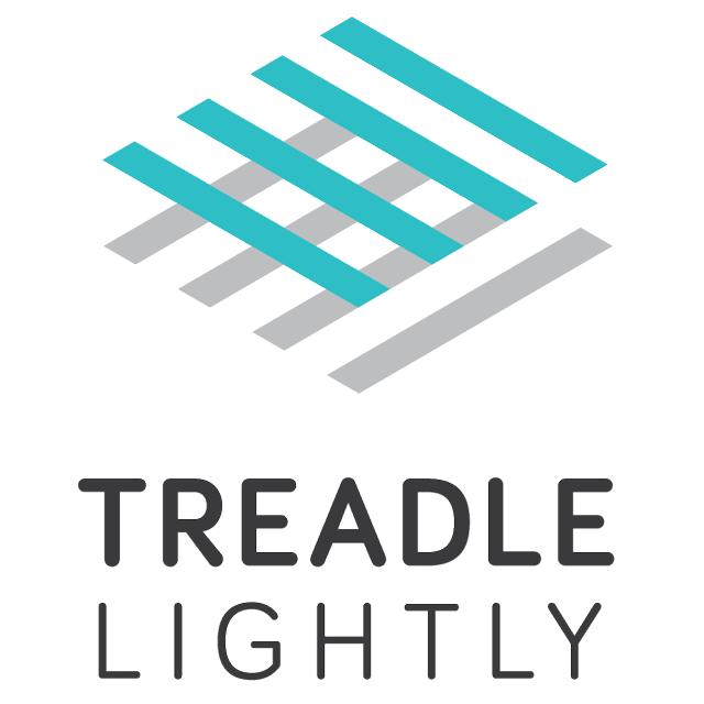
Weaving Conference
Logo and wordmark for a 2017 conference of weavers in the Pacific Northwest. Of note, the client, the Association of Northwest Weavers’ Guilds (lovely old ladies), were very friendly and the most organized to work with—they approached the branding of the conference three years in advance. The brief included the pre-selected “Treadle Lightly” pun to coincide…
-
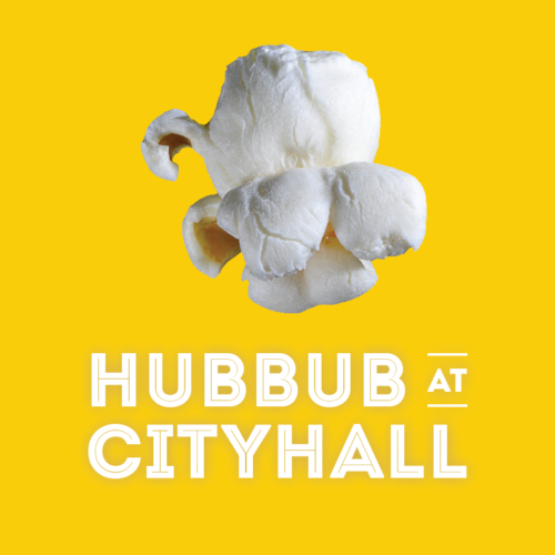
Hubbub at City Hall
Concept, branding and collateral for the end-of-semester exhibit and workshop for CityStudio, a non-profit education experiment that connects students with City of Vancouver staff on applied sustainability problem solving. With a budget of $200 and a one-month turnaround I developed the pop identity, a metaphor that plays off the kernels of ideas the students bring…
-
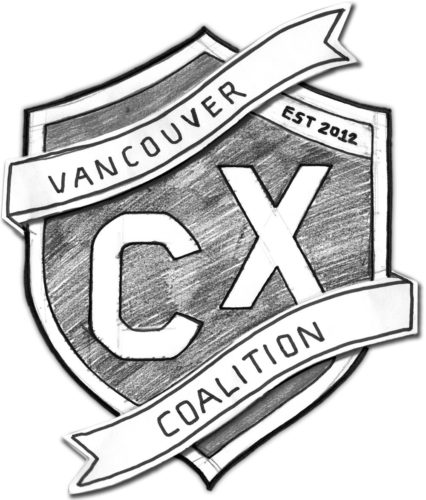
Vancouver Cyclocross Coalition
The newly-formed VCXC approached me to create a crest for their new cycling initiative. With a provided sketch and a couple evenings I iterated a number of wordmarks and monograms and developed them into a modernized heraldic crest for use on promotional posters, flyers and social media invites. The process involved hand sketching, scanning, digitizing,…