Graphics
-
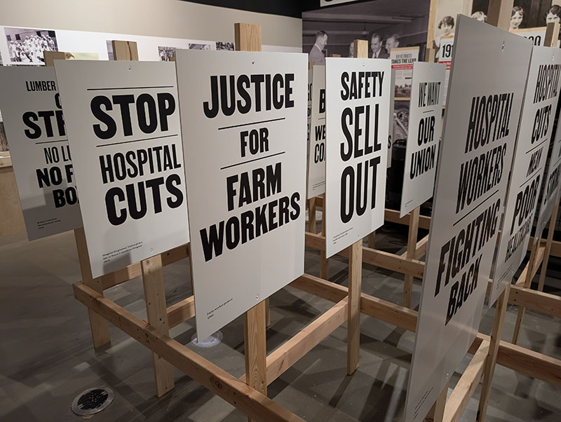
Solidarity Forever
Exhibit concept, design, layout and graphics, including print and social media marketing. New Westminster Museum and Archives, 2026.
-
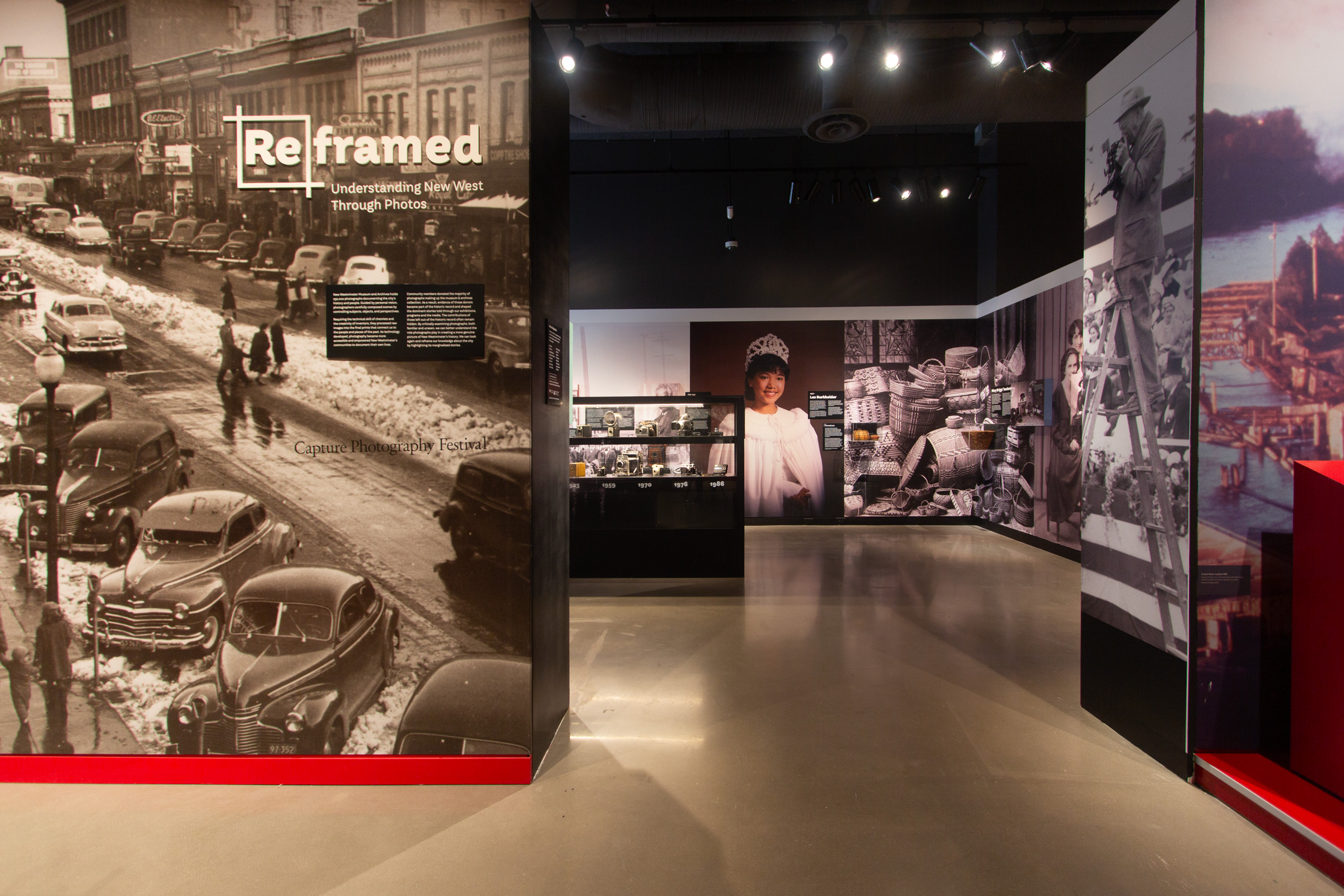
ReFramed
Design of the 2025 exhibit “ReFramed” at the New Westminster Museum, featuring stories of under-represented communities told through photography from the museum’s archives. Working with the curator and the museum’s fabrication team I created the layout and designed the wall-to-wall murals, camera and artifact displays, an interactive photography studio, as well as all the graphic…
-
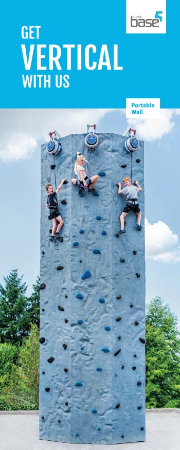
Base5
Brand rollout and marketing design—brochures, cards, posters, stickers—including an full revamp of key print materials to align with the gym’s new branding and branching out with single-use or short run promotions. For both gym locations in Vancouver, Canada. 2019–ongoing.
-
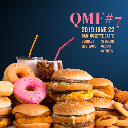
Quintuple Motherf*cker
Annual non-profit group ride I organized over the five hardest paved climbs in a single bike ride of 180km and 4,000m of elevation gain, in Vancouver, Canada. 2013–2020. Event marketing via social media—Instagram & Facebook—a different theme each year.
-
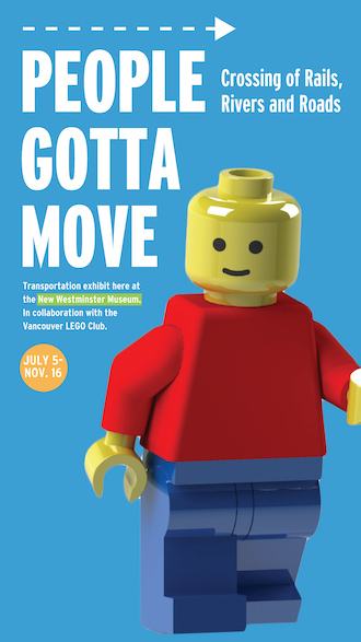
People Gotta Move
Exhibit graphics, branding, and marketing for the New Westminster Museum and Archives, including digital and print billboards, banners, posters, and full wall-wrapped interpretive panels. 2018.
-
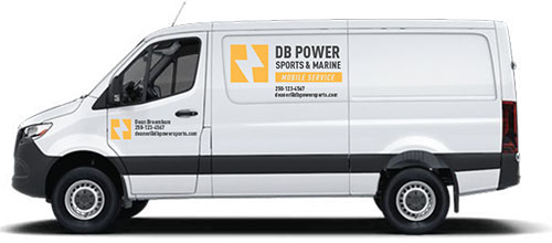
DB Power
Brand and collateral design for a small business launch. Simple and effective, particularly for the owner/operator to implement on their own, in the saturated outdoor powersport market of Kelowna, Canada.
-
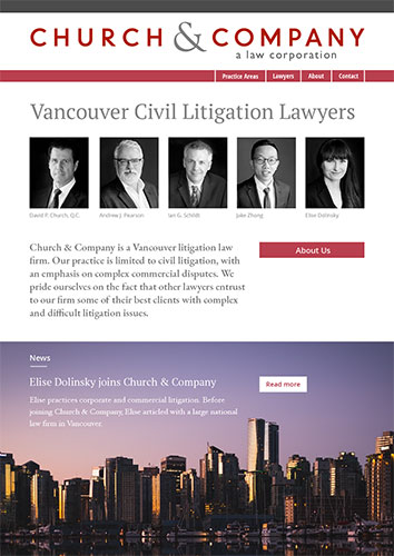
Church Legal
Website redesign and revised site map. Project coding and management by Paul Beard.
-
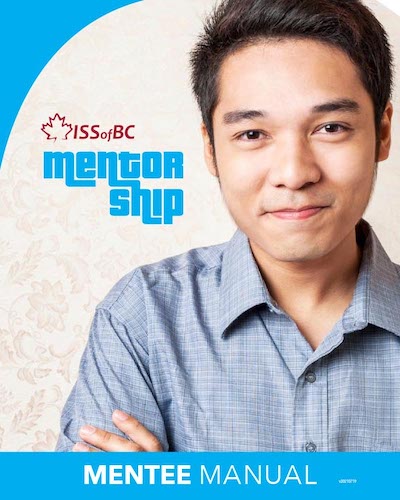
Mentor Guides
Series of three guides, colour and image-themed for quick identification. Developed for the non-profit Immigrant Services Society of BC and their mentoring program connecting students, staff, and businesses in Vancouver, Canada. Branding, font and icon selection, layout and print- and screen-ready booklets. A single file for each guide can be purposed by ISS staff for…
-
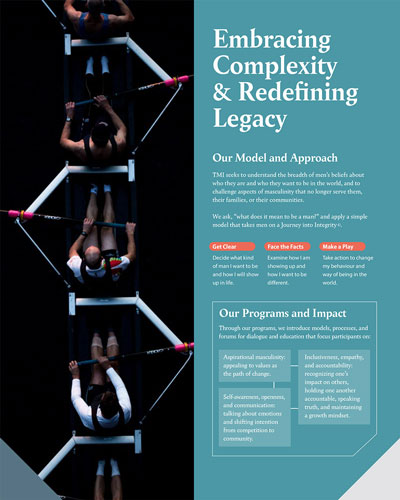
Men’s Initiative
Develop a new look & feel for an initiative founded at the University of British Columbia, starting with their 2020 Strategy and Business Development documents. Selected imagery, fonts, and colour palette. Exported for print and screen. 2020.
-
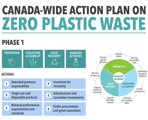
Action Plan: Zero Plastic Waste
-
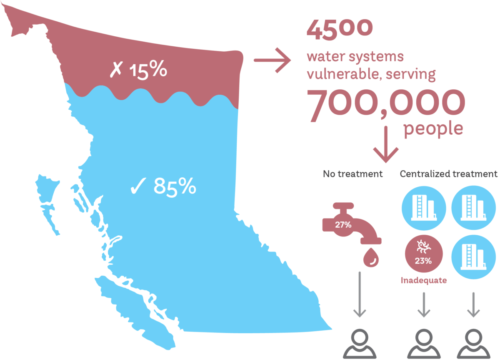
BC Water & Waste graphics
For the British Columbia Water & Waste Association pilot report, a set of vector info and theme-based graphic treatments and templates for current and future published reports, including a brand guide with typography, icon, and colour selection.
-

Inner Worlds Imprint Logo
Publishing imprint, including optional variations for use:
-
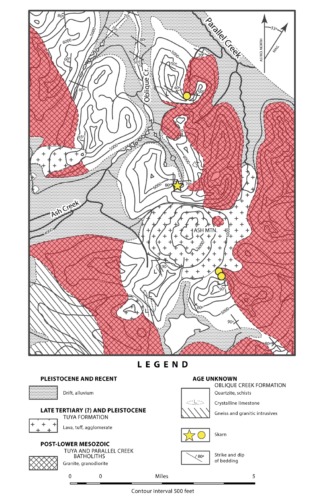
UBC EOS Map Rebuild
Vectorize and overlay new data for a mapping project with the University of British Columbia’s Earth and Ocean Sciences department.
-
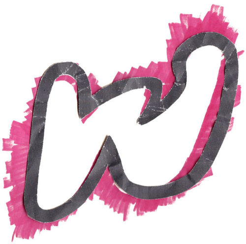
Group W Logo
“Alternative” bicycle racing group with a motive for mischief wanted “bad” logo to match their ongoing bad design efforts to produce collateral and clothing designs for their new club and race series. Inspiration included obscure Woody Guthrie lyrics and trash (literally). Gave myself one hour, tops, to produce the whole thing from hand drawing, to various scan methods…
-
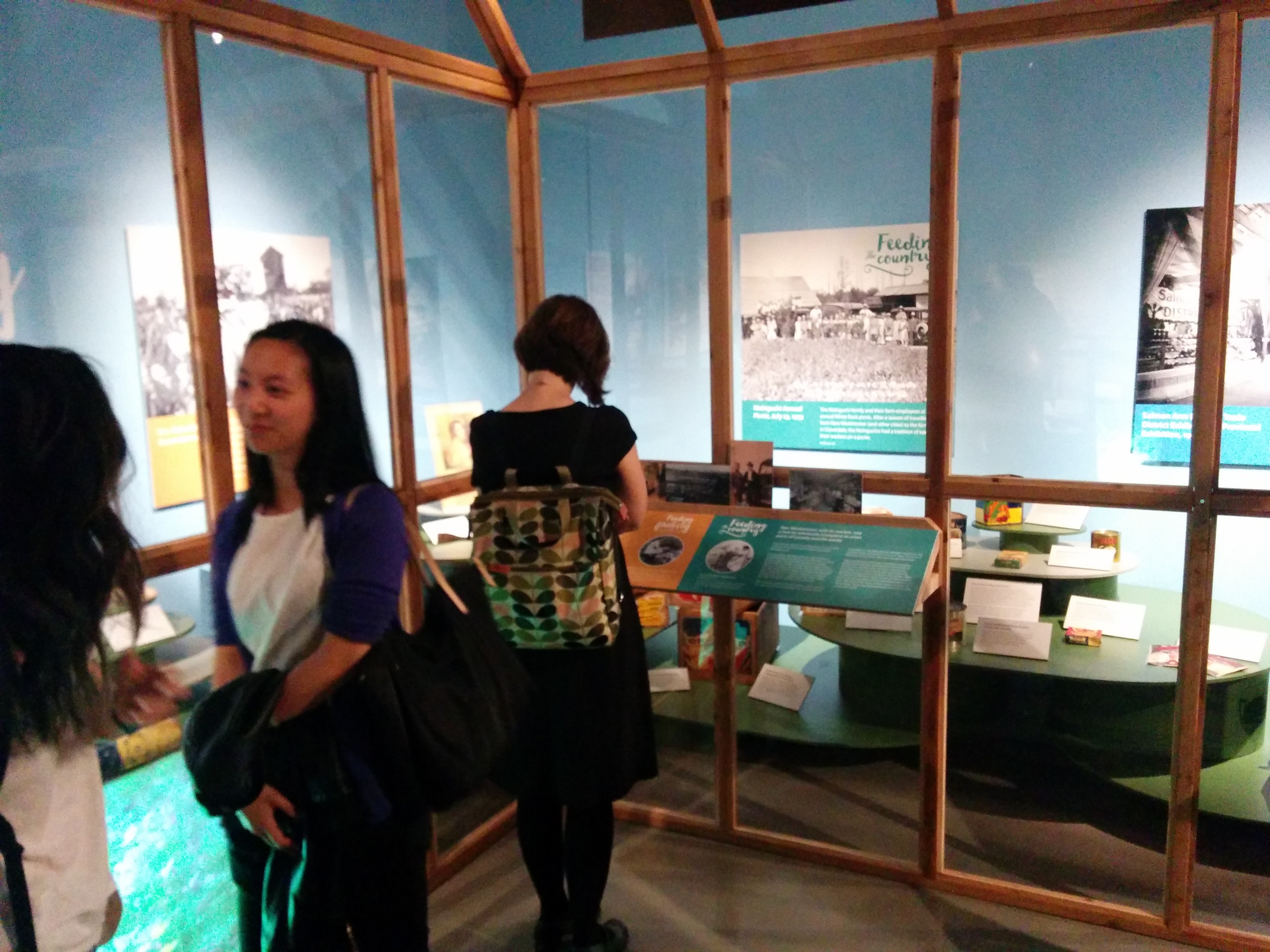
Branching Out Exhibit
Exhibit branding, marketing, and large format panel design and production for an exhibit at the New Westminster Museum and Archives. Working with the curatorial and install teams I was responsible for image selection from their archives, panel size, design, and materials, as well as overall look and feel of the marketing collateral. Exhibit posters. Exhibit cards…
-

Architectural Gems Exhibit
Exhibit branding, marketing, and large format panel design and production for an exhibit at the New Westminster Museum and Archives. Working with the curatorial and install teams I was responsible for image selection from their archives, panel size, design, and materials, as well as overall look and feel of the marketing collateral.
-
LCC Rebrand
Rebrand with new colour palette, logo and print & web themes for the Vancouver-based non-profit Language & Career College.
-
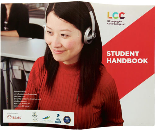
LCC Collateral
Re-brand and re-design of a variety of print materials for Vancouver based non-profit Immigrant Services Society Language & Career College, 2013–ongoing.
-

Weaving Conference
Logo and wordmark for a 2017 conference of weavers in the Pacific Northwest. Of note, the client, the Association of Northwest Weavers’ Guilds (lovely old ladies), were very friendly and the most organized to work with—they approached the branding of the conference three years in advance. The brief included the pre-selected “Treadle Lightly” pun to coincide…
-
Hubbub at City Hall
Concept, branding and collateral for the end-of-semester exhibit and workshop for CityStudio, a non-profit education experiment that connects students with City of Vancouver staff on applied sustainability problem solving. With a budget of $200 and a one-month turnaround I developed the pop identity, a metaphor that plays off the kernels of ideas the students bring…
-
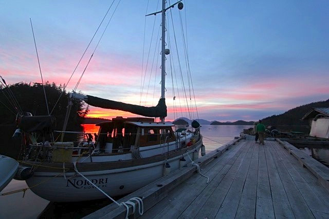
Nordri Wordmark
Custom wordmark and hull application in automotive vinyl on a refurbished North Sea 33 sailing boat, based out of Sidney, British Columbia. The name references the owner’s Scandinavian origins—Nordri being one the four dwarves of Norse mythology supporting the four cardinal directions. The eth character (crossbar on the ‘D’ in Nordri) is also a Scandinavian…
-

Vancouver Cyclocross Coalition
The newly-formed VCXC approached me to create a crest for their new cycling initiative. With a provided sketch and a couple evenings I iterated a number of wordmarks and monograms and developed them into a modernized heraldic crest for use on promotional posters, flyers and social media invites. The process involved hand sketching, scanning, digitizing,…
-
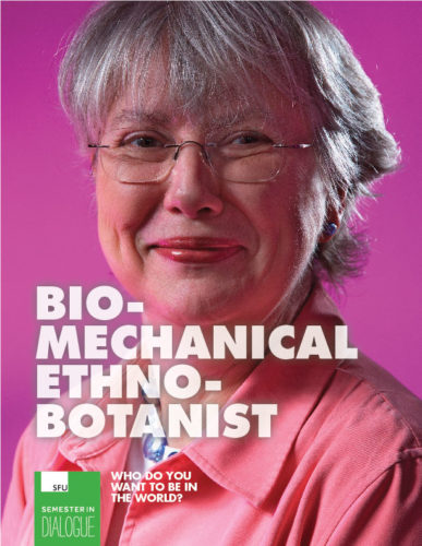
SFU Semester in Dialogue
Marketing campaign, concept and branding guidelines for Simon Fraser University’s Semester in Dialogue program. Working with directors, staff and faculty I coordinated a series of meetings and collaborative documents to distill the primary goals and obstacles the program faced in marketing itself and attracting not only more students within the university but also students of…
-
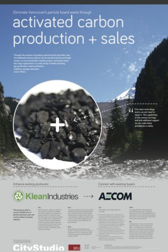
CityStudio SFU Posters
CityStudio, a multi-university collaboration institute working with the City of Vancouver, hired me to design a series of six information posters for their SFU Business students. Each class group had developed a marketing strategy and business development project related to deconstruction in Vancouver. While the research and analysis was great, they needed help creating a…
-
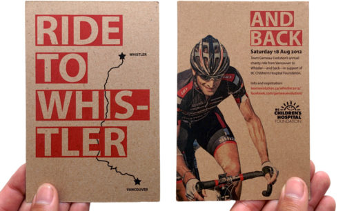
Whistler Ride
Printed handbill for local cycling team’s annual charity ride from Vancouver to Whistler, British Columbia. Recycled craft stock.
-
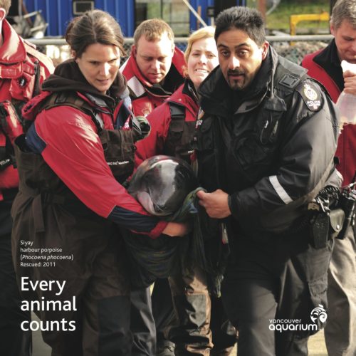
Marine Mammal Rescue Centre
Concept, design and development of a series of promotional and educational graphics and signage for the Vancouver Aquarium’s Marine Mammal Rescue Centre (MMRC) in Vancouver, a non-profit dedicated to assisting marine mammals in need of help along the British Columbia coastline for 50 years. In preparation for their annual open-house and fundraiser I created a…
-

Penguin Hat
Promotional handout for the Vancouver Aquarium. I designed the custom die-cut, offset printed run of 4,000. Two creased arcs encourage folding the flat print into a structured visor. Adjustable fit for children and adults. Illustration by New York-based artist Brendan Wenzel.
-
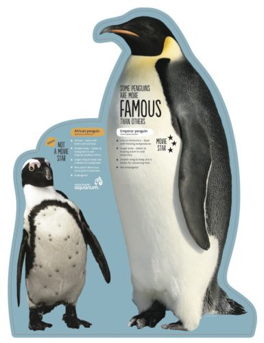
Penguin Point
Design and development of exhibit collateral for the Vancouver Aquarium’s Penguin Point, featuring seven African penguins in a new purpose-built habitat. As an education- and conservation-focused institution, exhibit panels were to function as a second layer—after the excitement of viewing the birds themselves—that could help describe and explain the seen behaviours and significance of these unique…
-
And We Were There
Proposed advertising campaign to project a new persona—while still showcasing its trust-worthy and veteran reputation—for one of Canada’s most senior naval architectural firms, Robert Allan Ltd., established Vancouver, 1930. The concept I developed, “We’re here. And we were there,” would play on both those notions by generating nostalgia with the public and industry clients through the use…
-
Clothing Swap