2D
-
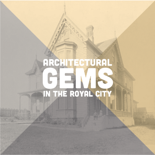
Architectural Gems Exhibit
Exhibit branding, marketing, and large format panel design and production for an exhibit at the New Westminster Museum and Archives. Working with the curatorial and install teams I was responsible for image selection from their archives, panel size, design, and materials, as well as overall look and feel of the marketing collateral.
-
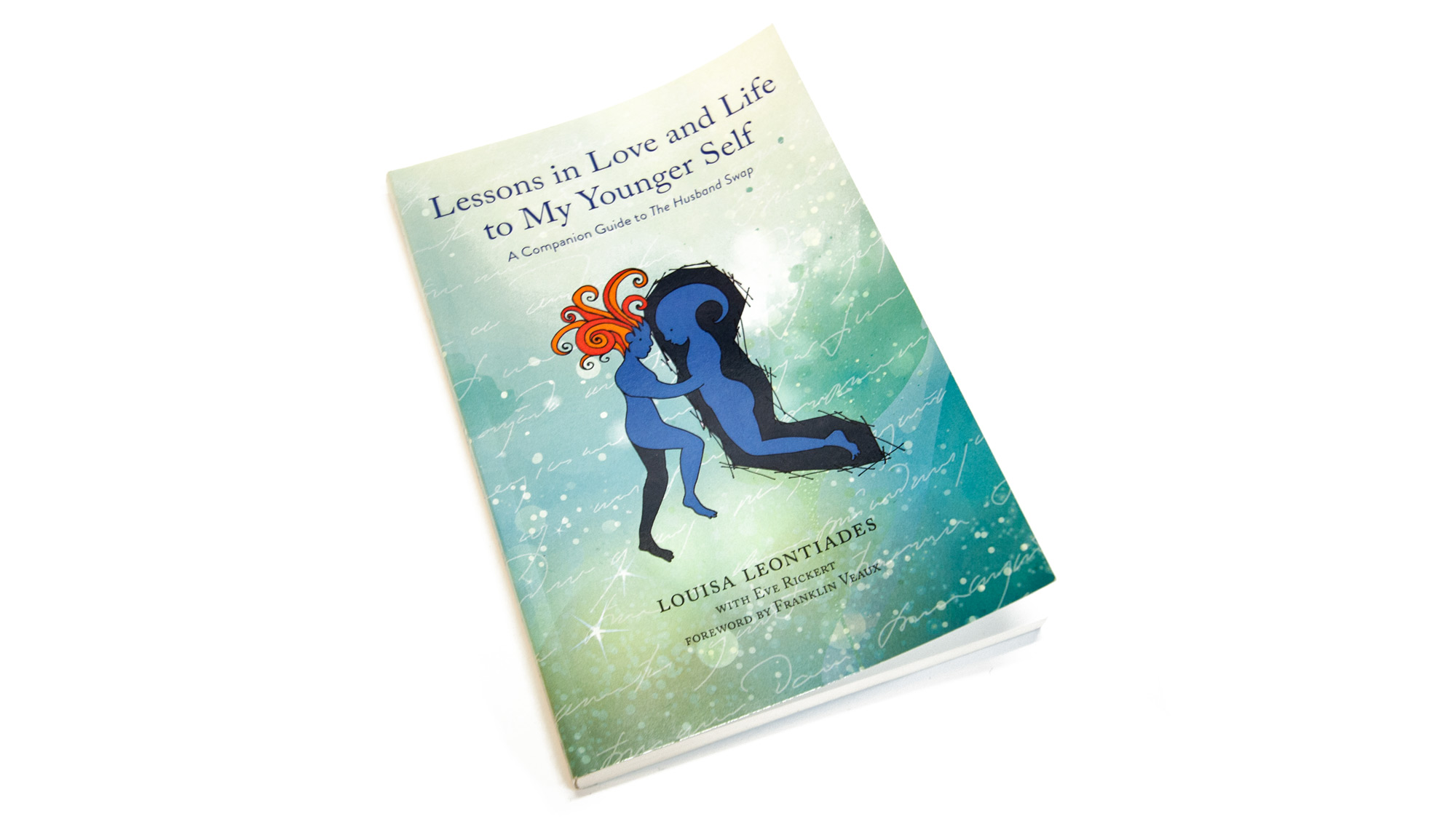
Lessons in Love and Life
Interior concept, design, and print production.
-
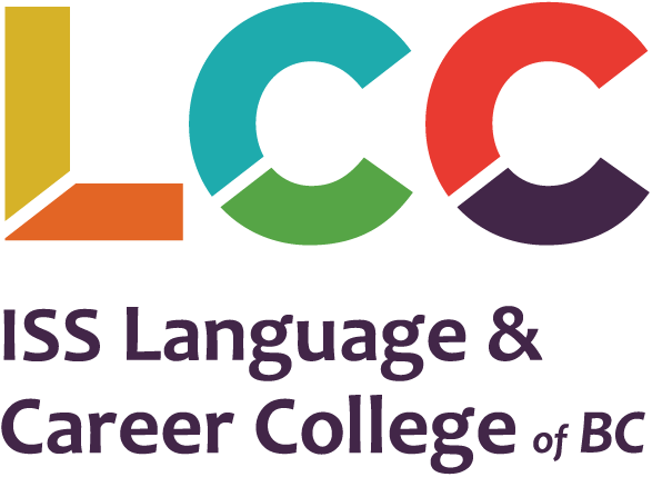
LCC Rebrand
Rebrand with new colour palette, logo and print & web themes for the Vancouver-based non-profit Language & Career College.
-
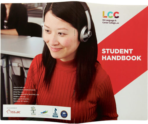
LCC Collateral
Re-brand and re-design of a variety of print materials for Vancouver based non-profit Immigrant Services Society Language & Career College, 2013–ongoing.
-
Weaving Conference
Logo and wordmark for a 2017 conference of weavers in the Pacific Northwest. Of note, the client, the Association of Northwest Weavers’ Guilds (lovely old ladies), were very friendly and the most organized to work with—they approached the branding of the conference three years in advance. The brief included the pre-selected “Treadle Lightly” pun to coincide…
-
Hubbub at City Hall
Concept, branding and collateral for the end-of-semester exhibit and workshop for CityStudio, a non-profit education experiment that connects students with City of Vancouver staff on applied sustainability problem solving. With a budget of $200 and a one-month turnaround I developed the pop identity, a metaphor that plays off the kernels of ideas the students bring…
-
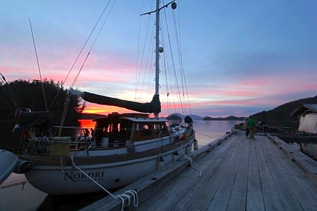
Nordri Wordmark
Custom wordmark and hull application in automotive vinyl on a refurbished North Sea 33 sailing boat, based out of Sidney, British Columbia. The name references the owner’s Scandinavian origins—Nordri being one the four dwarves of Norse mythology supporting the four cardinal directions. The eth character (crossbar on the ‘D’ in Nordri) is also a Scandinavian…
-
Vancouver Cyclocross Coalition
The newly-formed VCXC approached me to create a crest for their new cycling initiative. With a provided sketch and a couple evenings I iterated a number of wordmarks and monograms and developed them into a modernized heraldic crest for use on promotional posters, flyers and social media invites. The process involved hand sketching, scanning, digitizing,…
-
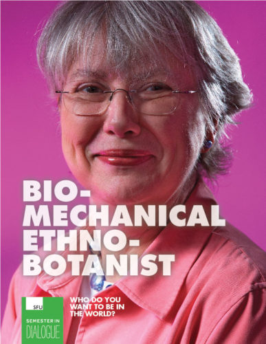
SFU Semester in Dialogue
Marketing campaign, concept and branding guidelines for Simon Fraser University’s Semester in Dialogue program. Working with directors, staff and faculty I coordinated a series of meetings and collaborative documents to distill the primary goals and obstacles the program faced in marketing itself and attracting not only more students within the university but also students of…
-
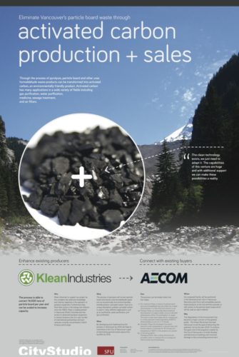
CityStudio SFU Posters
CityStudio, a multi-university collaboration institute working with the City of Vancouver, hired me to design a series of six information posters for their SFU Business students. Each class group had developed a marketing strategy and business development project related to deconstruction in Vancouver. While the research and analysis was great, they needed help creating a…
-
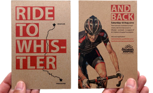
Whistler Ride
Printed handbill for local cycling team’s annual charity ride from Vancouver to Whistler, British Columbia. Recycled craft stock.
-
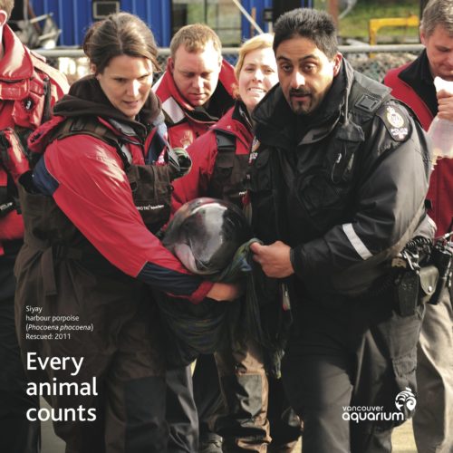
Marine Mammal Rescue Centre
Concept, design and development of a series of promotional and educational graphics and signage for the Vancouver Aquarium’s Marine Mammal Rescue Centre (MMRC) in Vancouver, a non-profit dedicated to assisting marine mammals in need of help along the British Columbia coastline for 50 years. In preparation for their annual open-house and fundraiser I created a…
-

Penguin Hat
Promotional handout for the Vancouver Aquarium. I designed the custom die-cut, offset printed run of 4,000. Two creased arcs encourage folding the flat print into a structured visor. Adjustable fit for children and adults. Illustration by New York-based artist Brendan Wenzel.
-
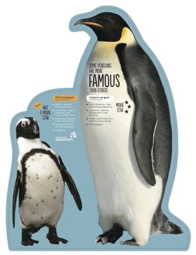
Penguin Point
Design and development of exhibit collateral for the Vancouver Aquarium’s Penguin Point, featuring seven African penguins in a new purpose-built habitat. As an education- and conservation-focused institution, exhibit panels were to function as a second layer—after the excitement of viewing the birds themselves—that could help describe and explain the seen behaviours and significance of these unique…
-
And We Were There
Proposed advertising campaign to project a new persona—while still showcasing its trust-worthy and veteran reputation—for one of Canada’s most senior naval architectural firms, Robert Allan Ltd., established Vancouver, 1930. The concept I developed, “We’re here. And we were there,” would play on both those notions by generating nostalgia with the public and industry clients through the use…
-
Clothing Swap
-
Advent Calendar
-
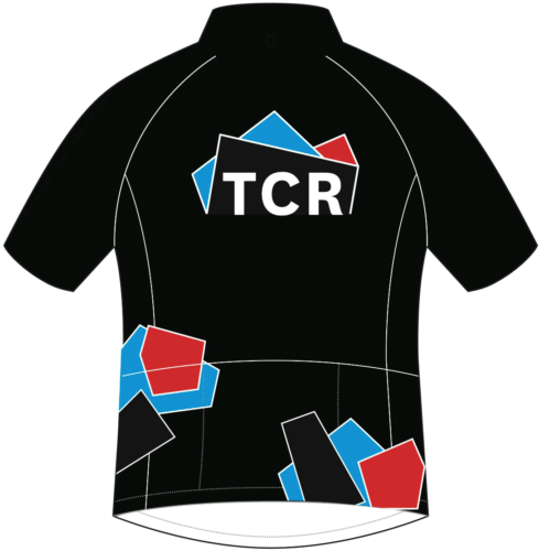
TCR Identity
Identity and applications developed for a local cycling team, Triple Crown Racing. From initial rides together to final vector files, approx. two weeks. Inspired by cycling racing colours of the 1990s and the profile of Vancouver’s notorious ‘triple crown’ mountains: Cypress, Grouse and Seymour. Vancouver, 2011. Part of the development process involved communicating remotely with…
-
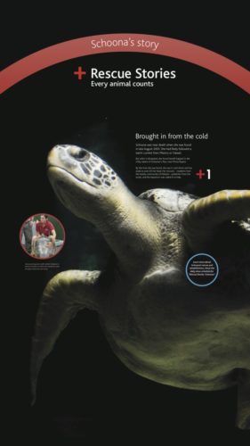
Rescue Stories
Marketing identity and exhibit graphics for the Vancouver Aquarium’s Fall 2011 promotion, Rescue Stories, highlighting the animals and work the non-profit has done in both rescuing, rehabilitating and releasing or caring for a variety of marine-based animals in its long history of conservation. Key to telling each animal’s story, many of which had resided at…
-
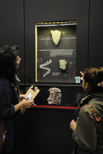
Beaty Museum Displays
Over the course of nine-months I was contracted to design, illustrate and produce exhibits and graphic collateral for the launch of the Beaty Biodiversity Museum at the University of British Columbia. I created over 100 displays examining a range of ecological, conservation and evolutionary topics, incorporating hundreds of specimens and working in conjunction with the…
-
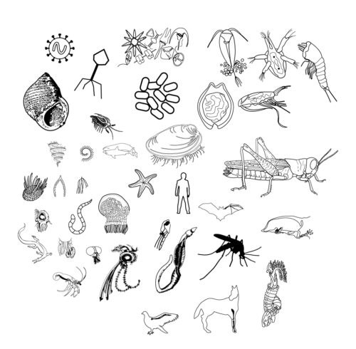
Biodiversity Illustrations
Sample of vector illustrations created from provided imagery and researcher descriptions for the Beaty Biodiversity Museum, Vancouver, 2010–2011.
-
Womens Cycling Camp
I joined a cycling club in Vancouver this year and they asked me to design a poster for them. Womens Cycling Camp is a month long, bi-weekly set of lessons led by my friend and coach/racer Lisa Howard. It’s for women ages 15-22 that want to learn some organized cycling skills (how to ride a…
-

Healthy Oceans
I was contracted by the David Suzuki Foundation to develop a focused online campaign for the environmental organization’s Healthy Oceans initiative. Working with marine mapping data I created a Google Earth fly-over of at-risk ocean areas while designing and coding a website featuring user-submitted videos, an online petition to the federal government, and an embedded…
-
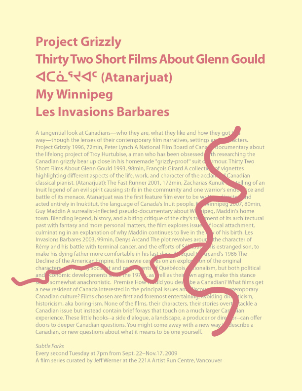
Subtle Forks
A tangential look at Canadians—who they are, what they like and how they got this way—though the lenses of their contemporary film narratives, settings and characters. A series of films I curated for the fall 2009 screenings at the 221A Artist Run Centre in Vancouver.
-
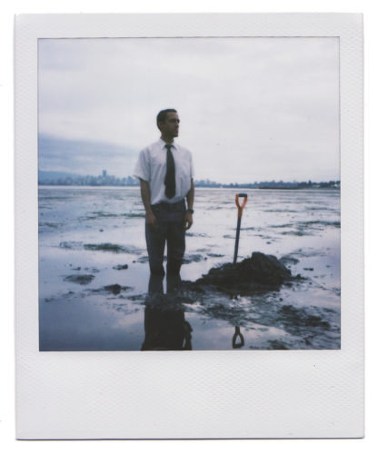
Lower Vancouver
During low tide a 0.5 cubic metre of sand is removed from the Spanish Banks beach in the City of Vancouver, lowering the average elevation of the city by 0.00000000055 per cent. August, 2009. Photography by Jason Edwards. With the assistance of Brian McBay, Michael Johnson, Oliver Li. Poster, shovel and bucket of sand later…
-
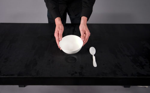
Nice Fit
A 16-month design thesis in collaboration with Tobias Ottahal, exploring how objects fit together in subtly satisfying ways. The project developed over two major phases and two manifestations: The table creates indentions for objects to fit into on demand; when the object is removed, the table becomes flat again. In addition to exploring conceptual and…
-

Big Ambition Campaign
Concept, design and custom fabrication for a bus shelter ad campaign. After securing a $37,000 worth of advertising budget from the City of Vancouver and CBS we created this parallel slogan and graphic identity to run in select shelter spaces. During daylight hours the official poster slogan reads “Small school big ambition” while at night…
-
Grad Website 2009
Joint concept, design and coding. Tasked with building the Emily Carr Graduation website in one week, designer Alex Buss and I set a number of goals, chiefly to make it as easy as possible for visitors to view work, to download it and to redistribute it online. We eliminated superfluous pop-ups and click-throughs found in…
-
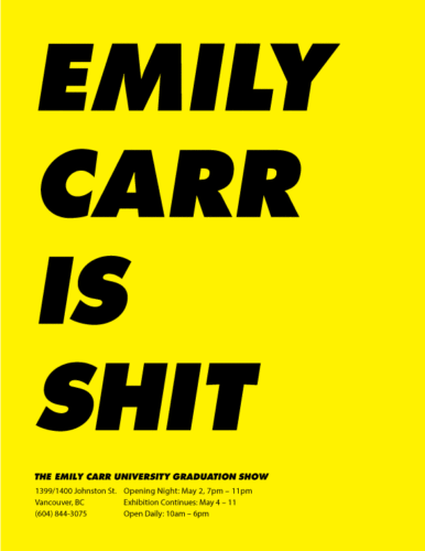
Emily Carr Says What?
Advertising campaign proposal for the university’s Graduation Exhibition. After securing $37,000 in donated advertising space we designed a series of two-part campaign posters. Short slogans appear to disparage, or have fun with, the school’s reputation. But when backlit, turned, or re-read new and improved slogans are revealed. Language translations were produced based on city demographics…
-
Steal This Poster
I was the organizer for a guest lecture with David Wotherspoon, commercial litigator in intellectual property, at the Emily Carr University entitled “Who Owns Your Art & Design”. Developed with co-organizer Amanda Huynh, in conjunction with the National Research Council of Canada. February, 2009.